Rit Dye Advertising Campaign
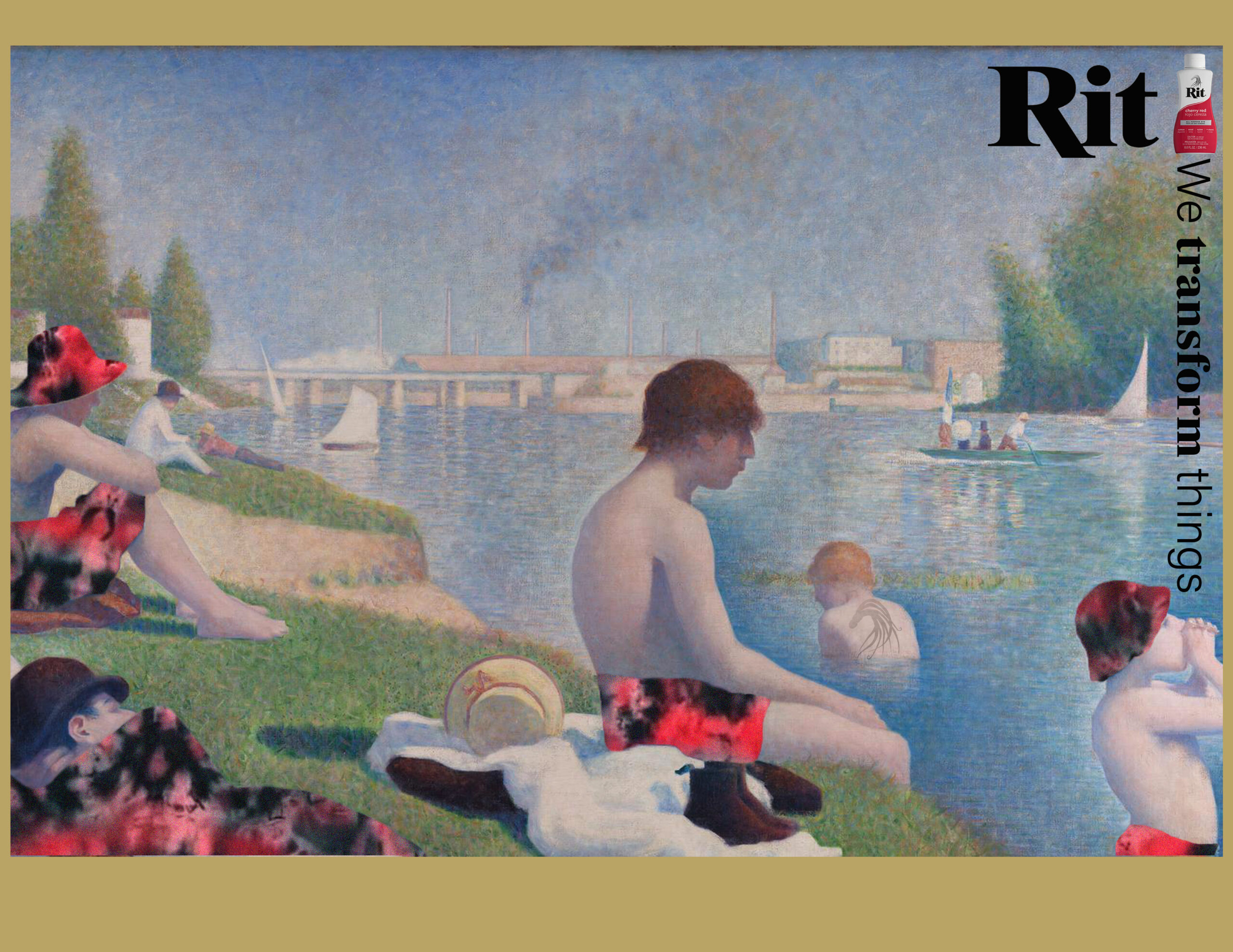
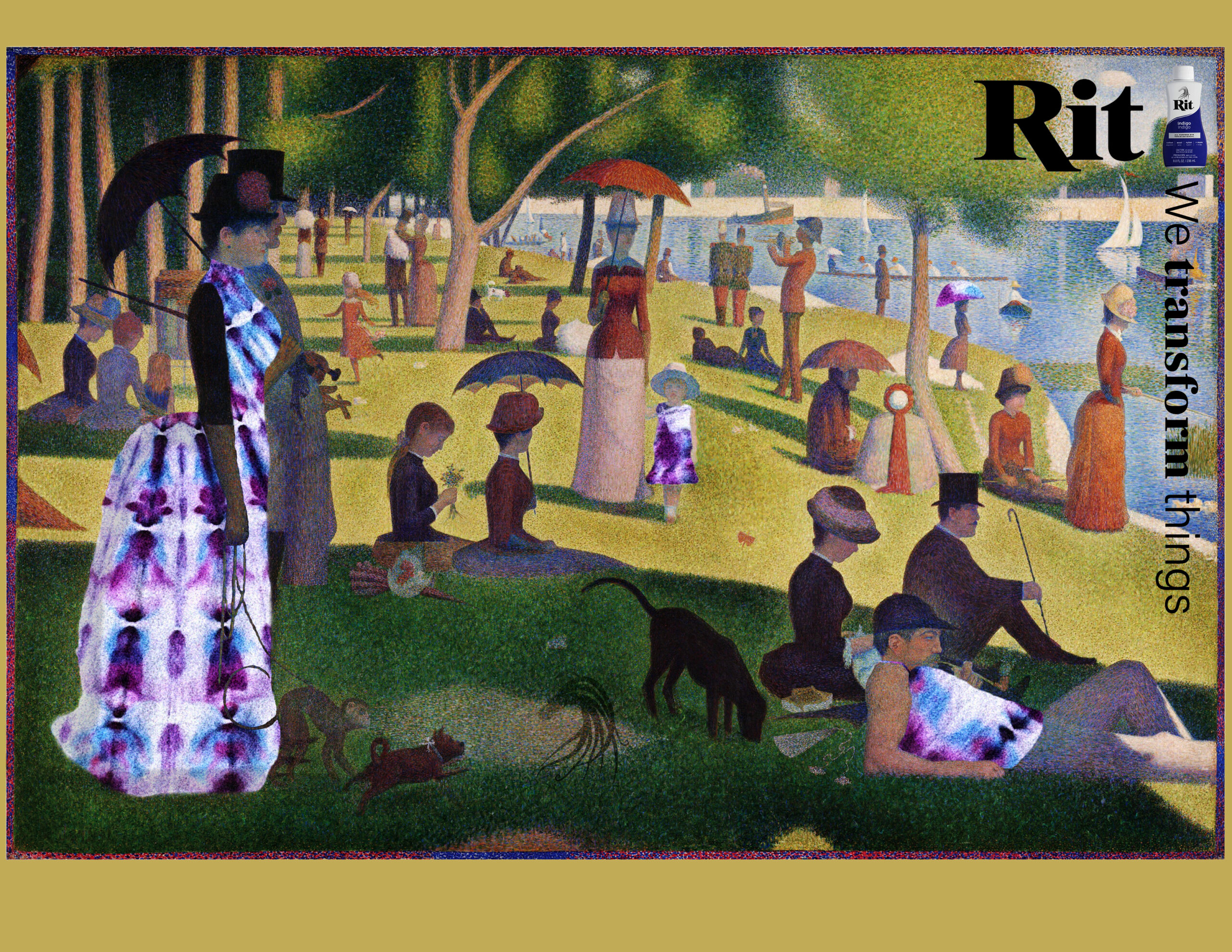
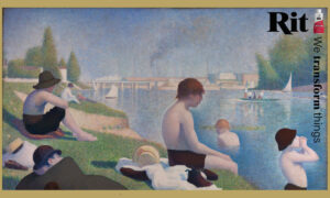
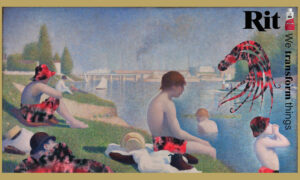
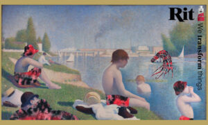
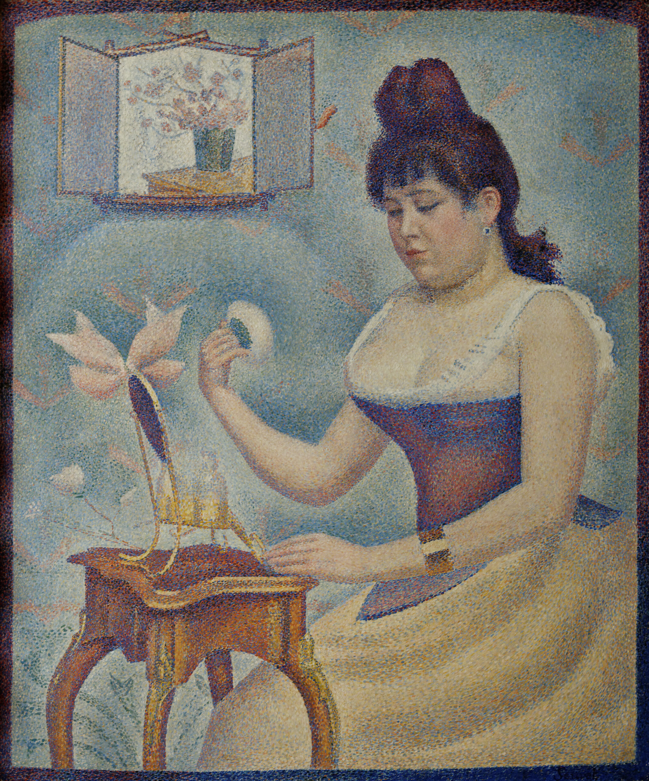
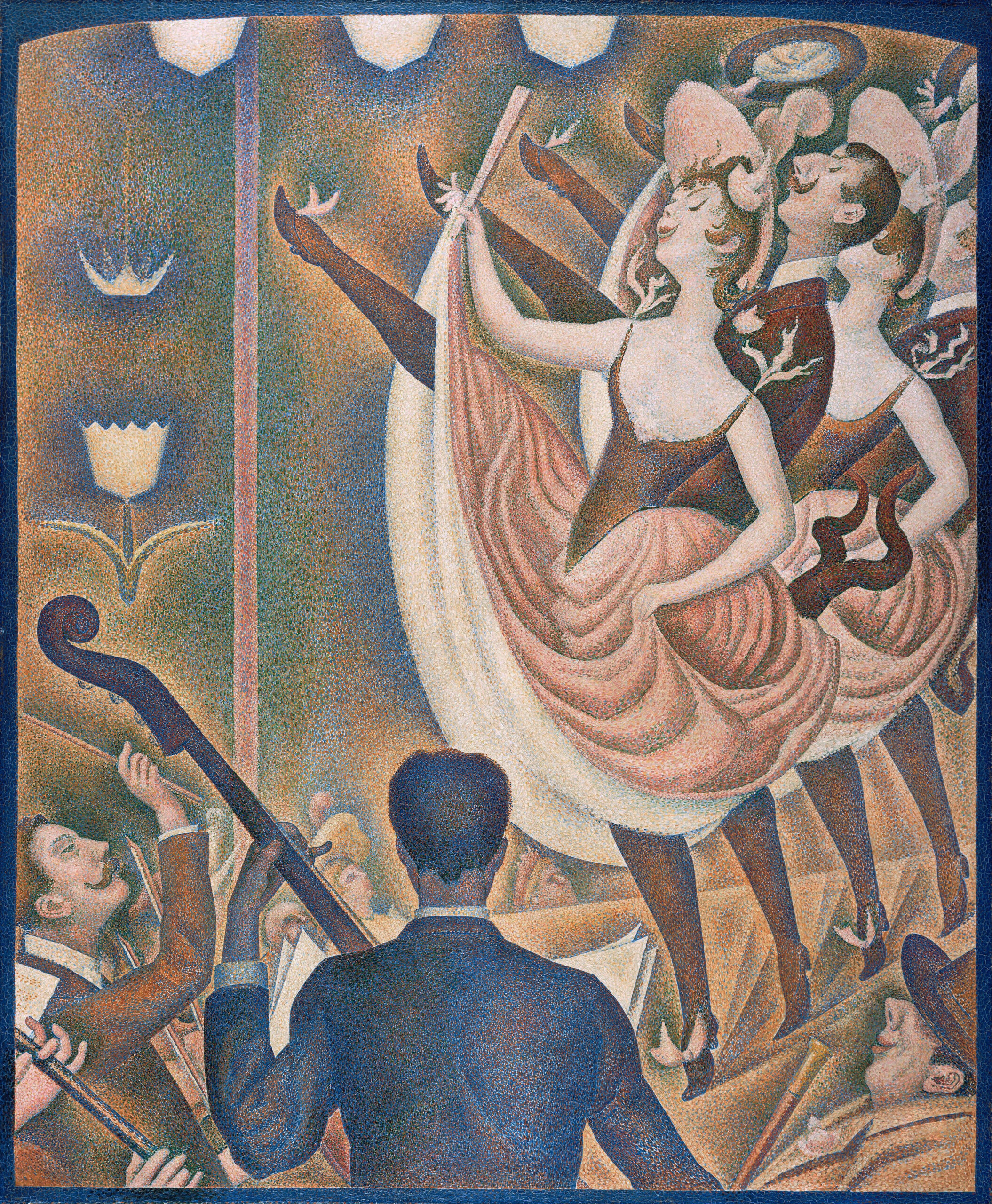
This advertising campaign transforms paintings by Georges Seurat with splashes of tie-dye color. The new Rit Logo, Ritty the octopus is incorporated into the artwork, as well as the updated packaging.
Background
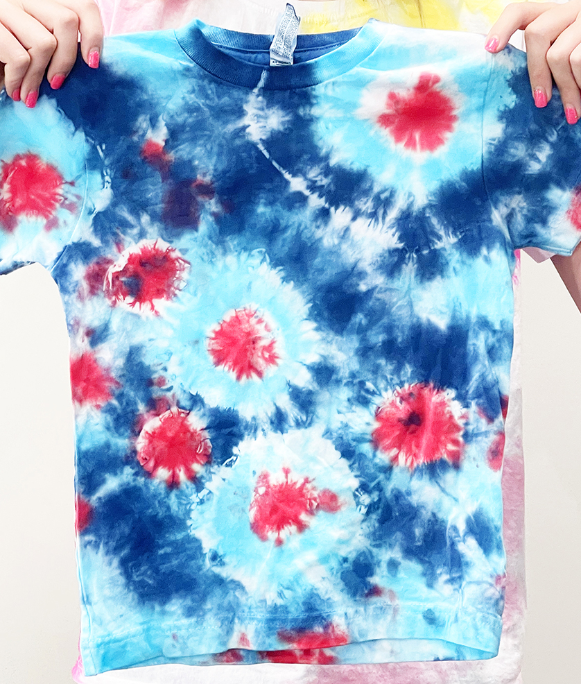
I love tie-dye and grew up making my own t-shirts, socks, sheets, etc. I was excited to work with this brand and show how exciting tie-dye can be.
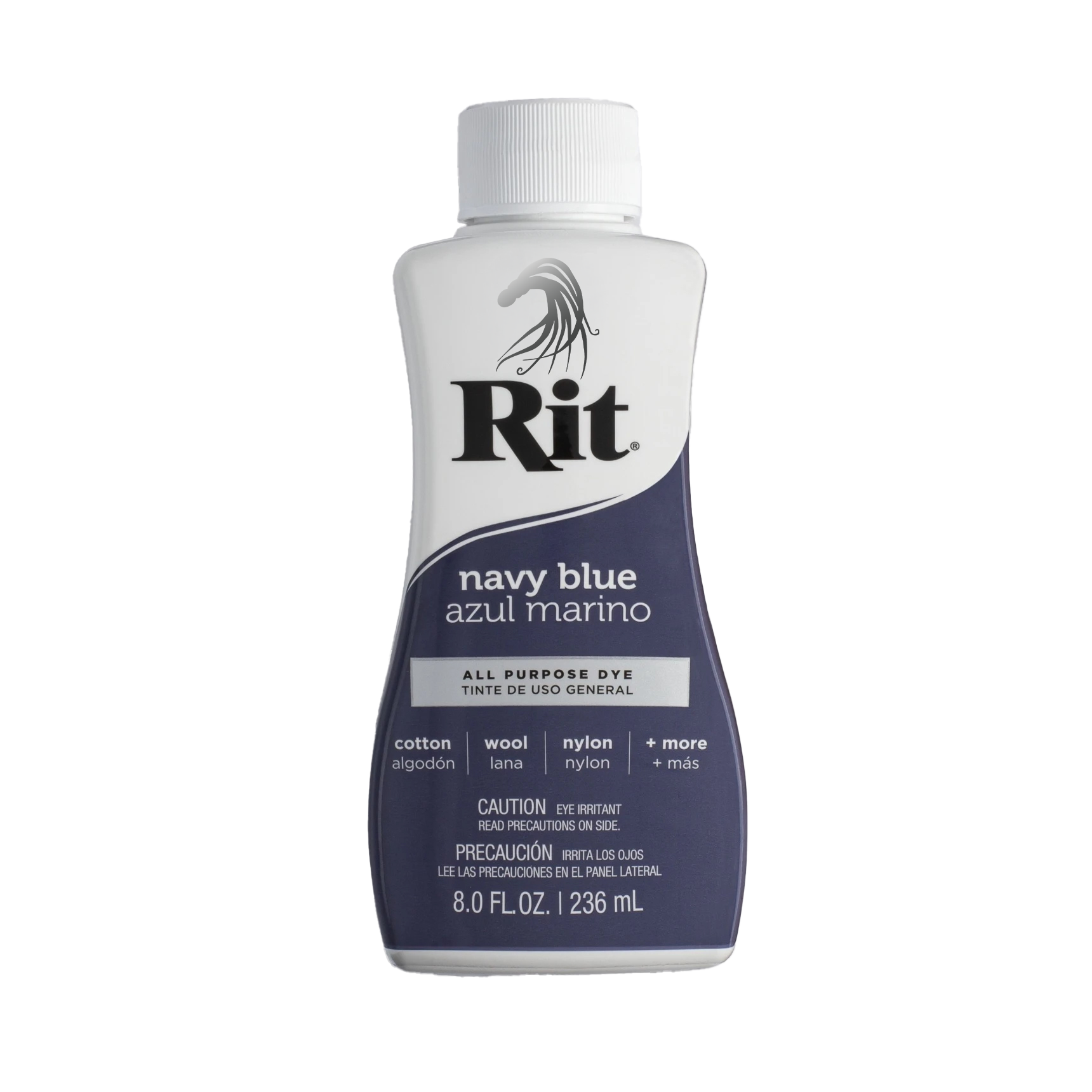
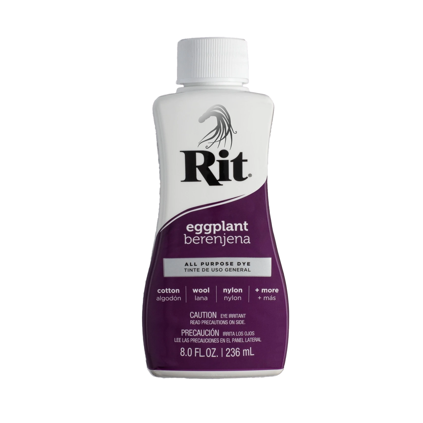
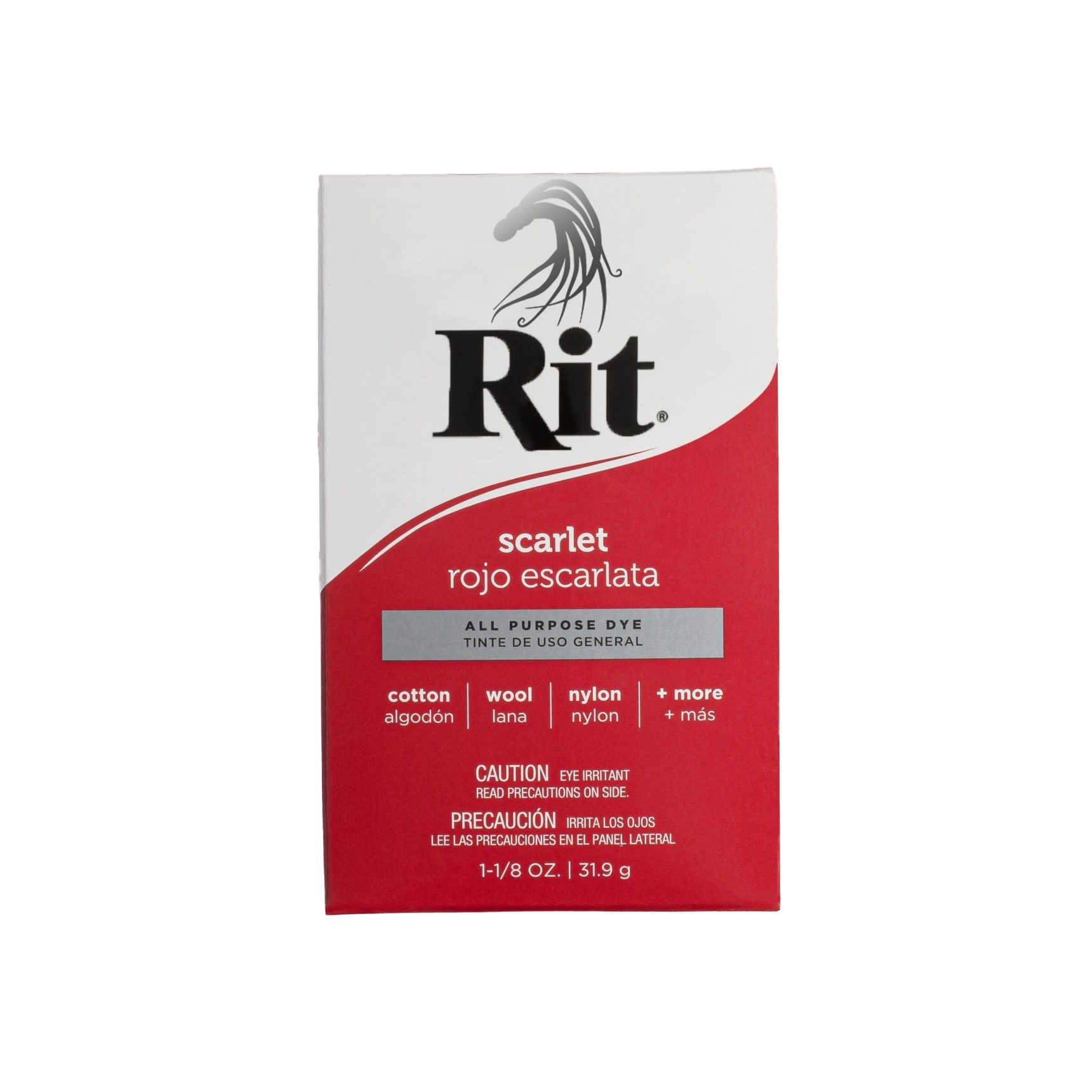
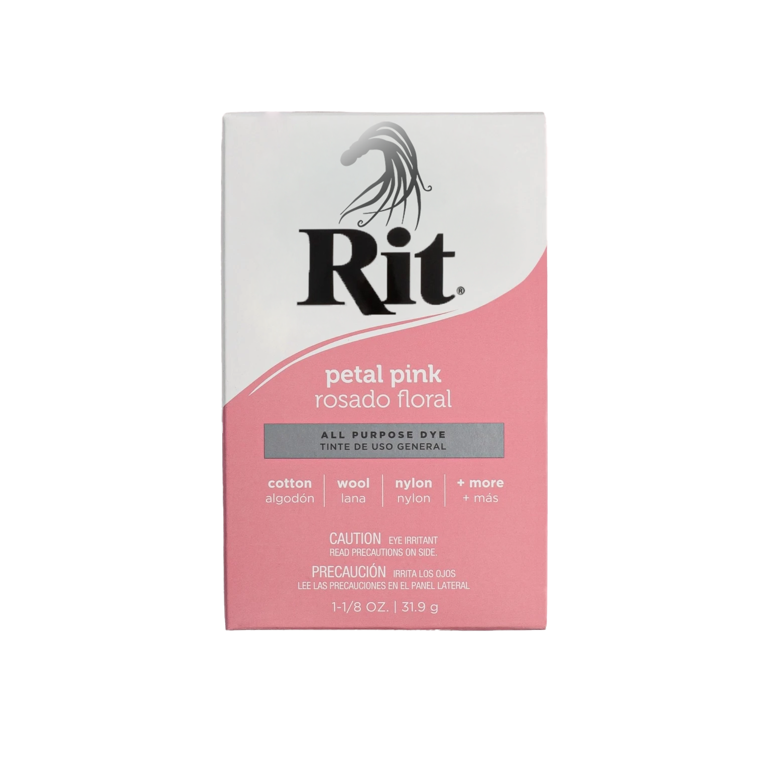
Rit is an American brand of dye first sold in 1916. It is owned by Nakoma Products. Rit is a commercial dye used for household purposes, including dyeing clothes and wood. It is sold in liquid and powdered forms. The items being dyed are soaked with Rit in hot water.
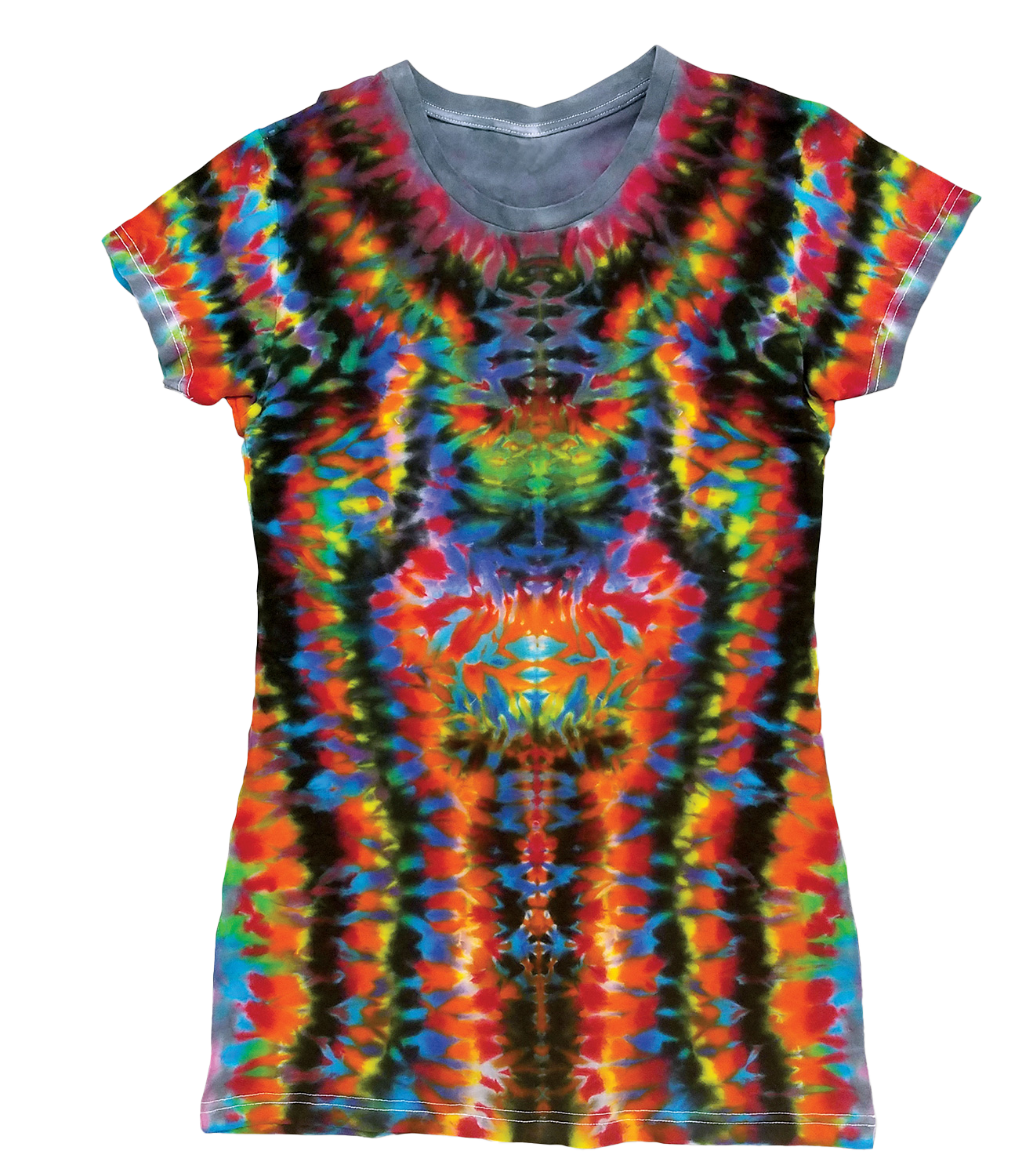
Rit is an excellent dye to use for tie-dye. Tie-dye is a term used to describe several dyeing techniques and the resulting dyed products of these processes. The process of tie-dye typically consists of folding, twisting, pleating, or crumpling fabric or a garment, before binding with string or rubber bands, followed by the application of dye to transform the material.
Target Audience
People who use the product and dye clothes and materials. People who enjoy arts and crafts and that enjoy tie-dyeing things. Art lovers. People who challenge the conventional or have an appreciation for bright colors or punk rock hair.
Design Problem
Rit Dye is an old company, and their advertising, logo and website would benefit from some updates. In addition to looking dated, their current designs do not focus on what the product does. Rit dye transforms things. It changes them. It can make them more vibrant. It can make them darker. The transformation of clothing and materials is exciting and there is an opportunity to give them updated advertising materials as well as a logo that can be used to reinforce the idea that Rit Transforms clothing and materials. Everything in their branding should be tied to transformation. Rit is for transformation!
Design Process
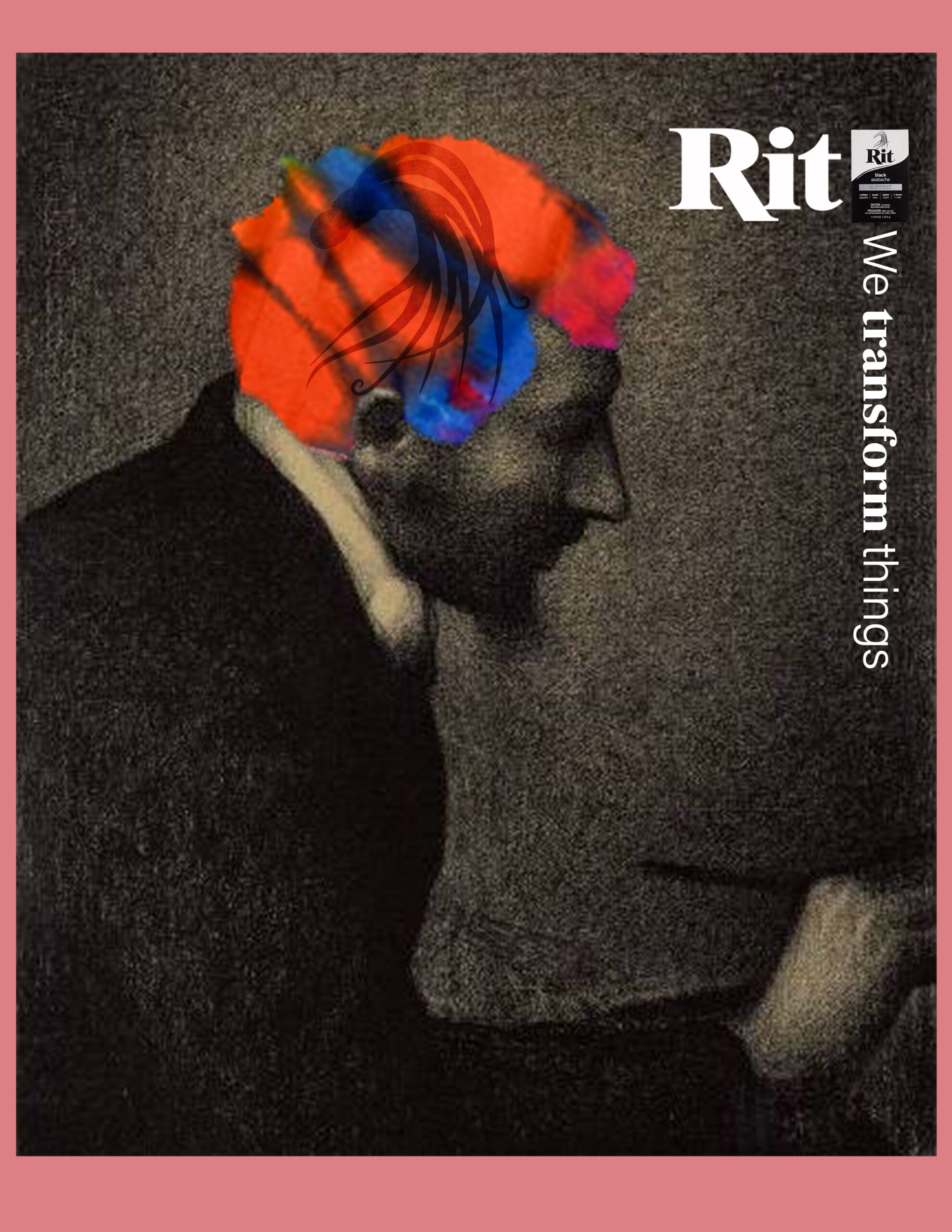
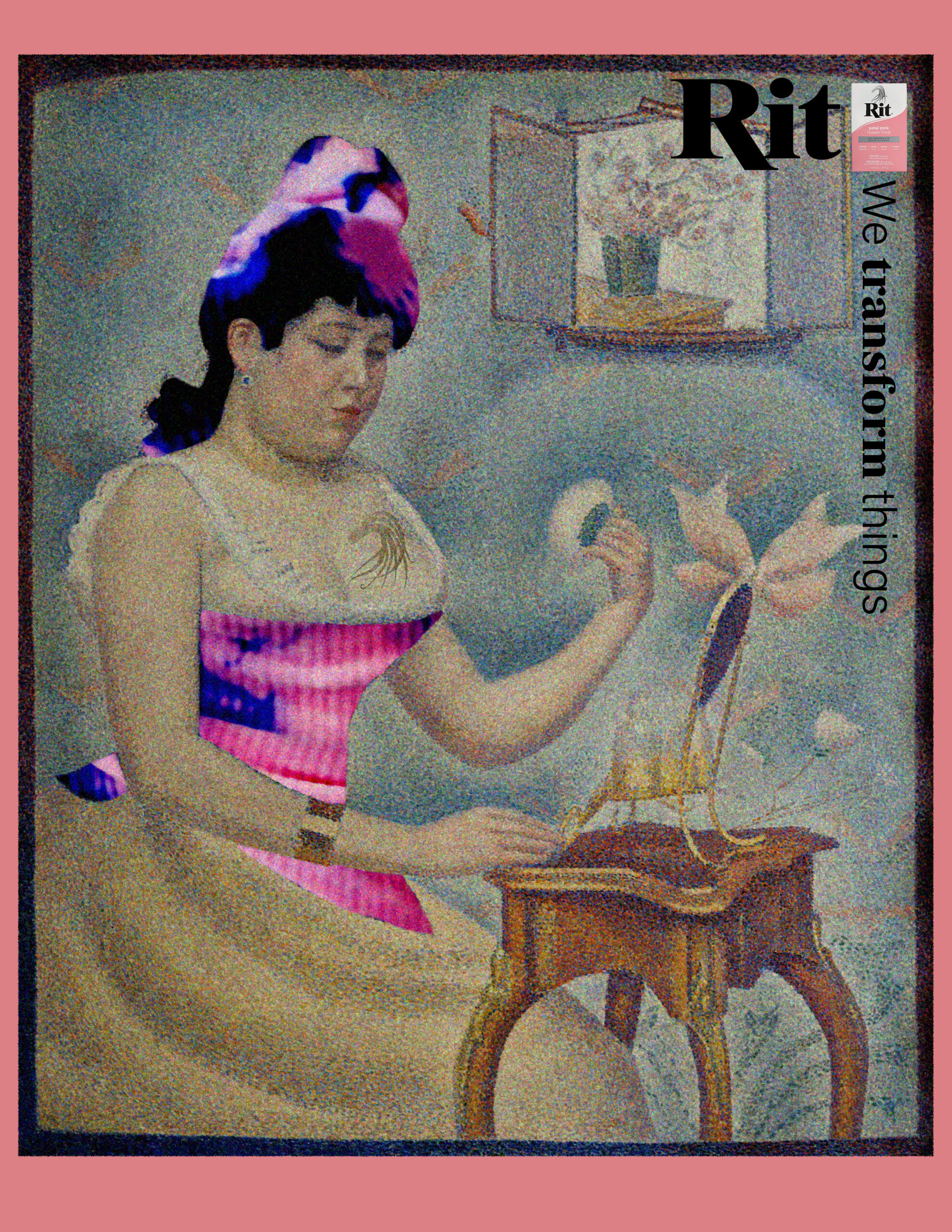
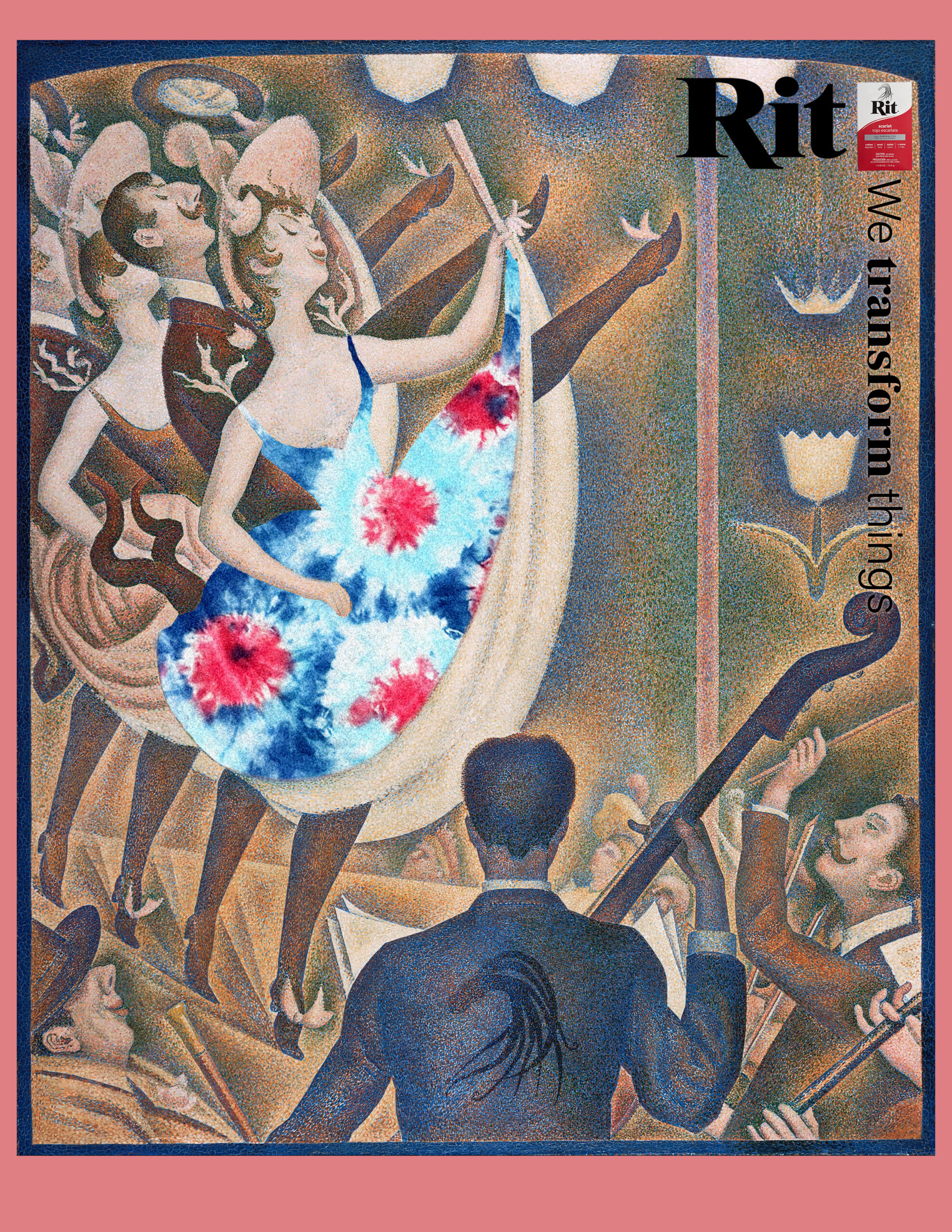
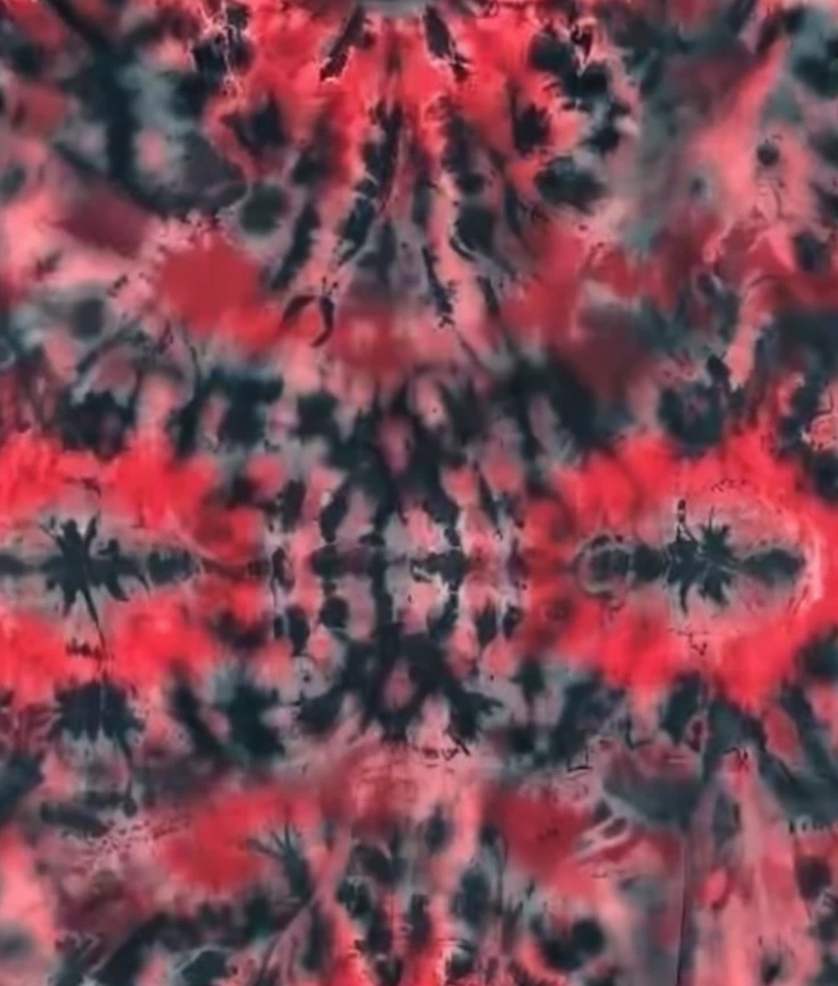
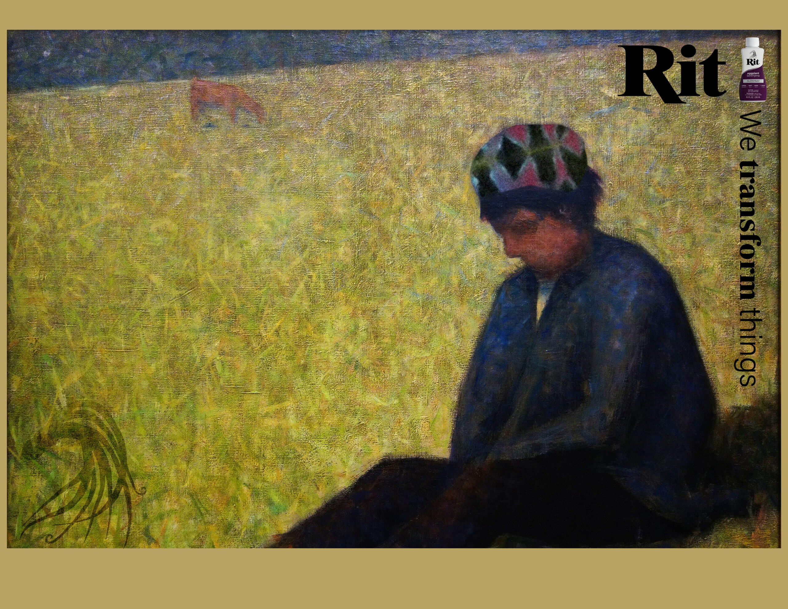
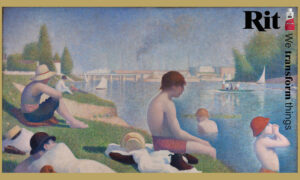
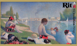
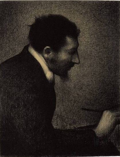
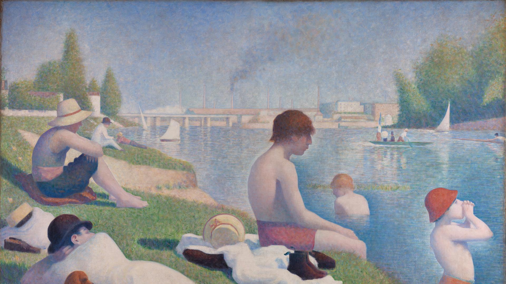
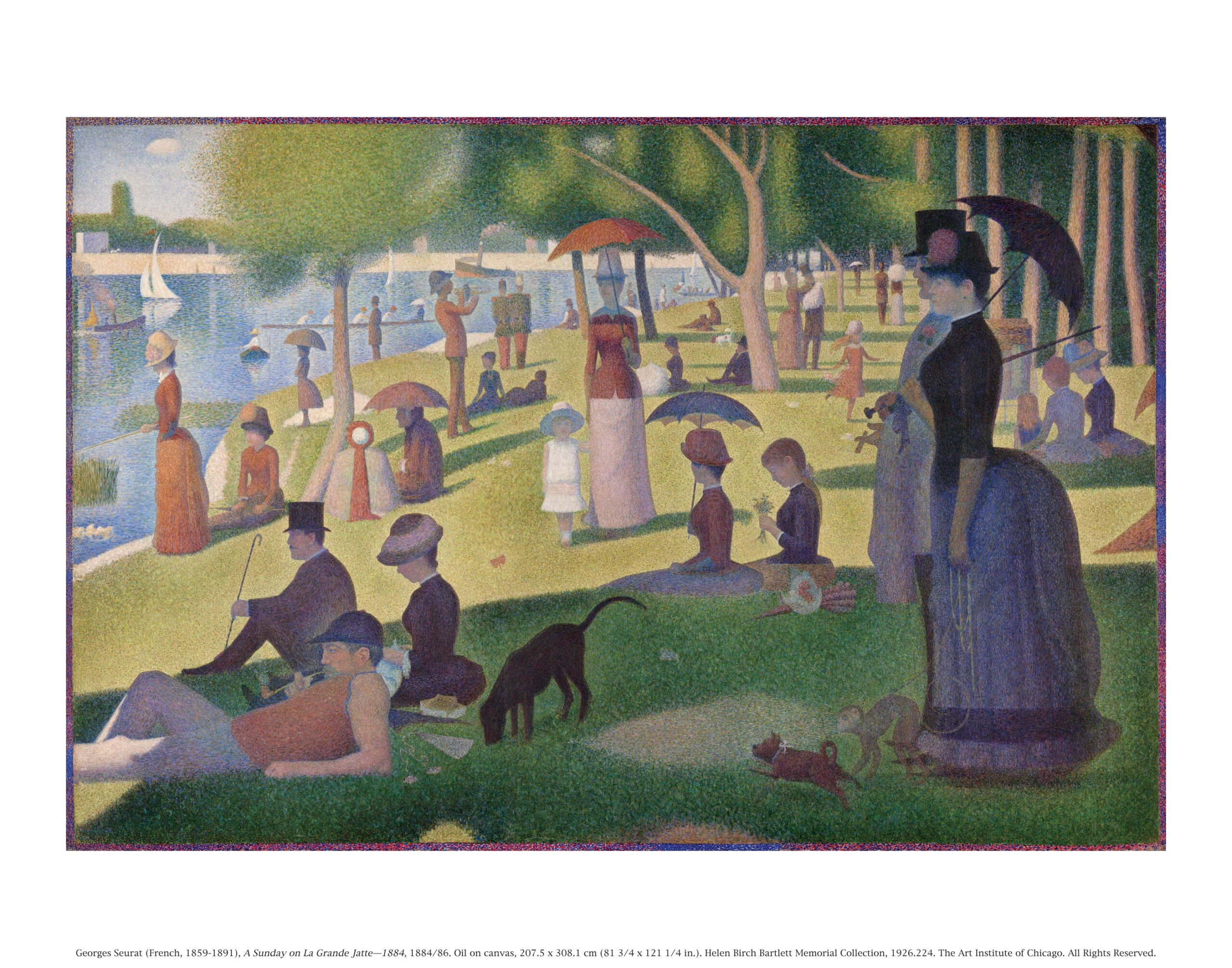
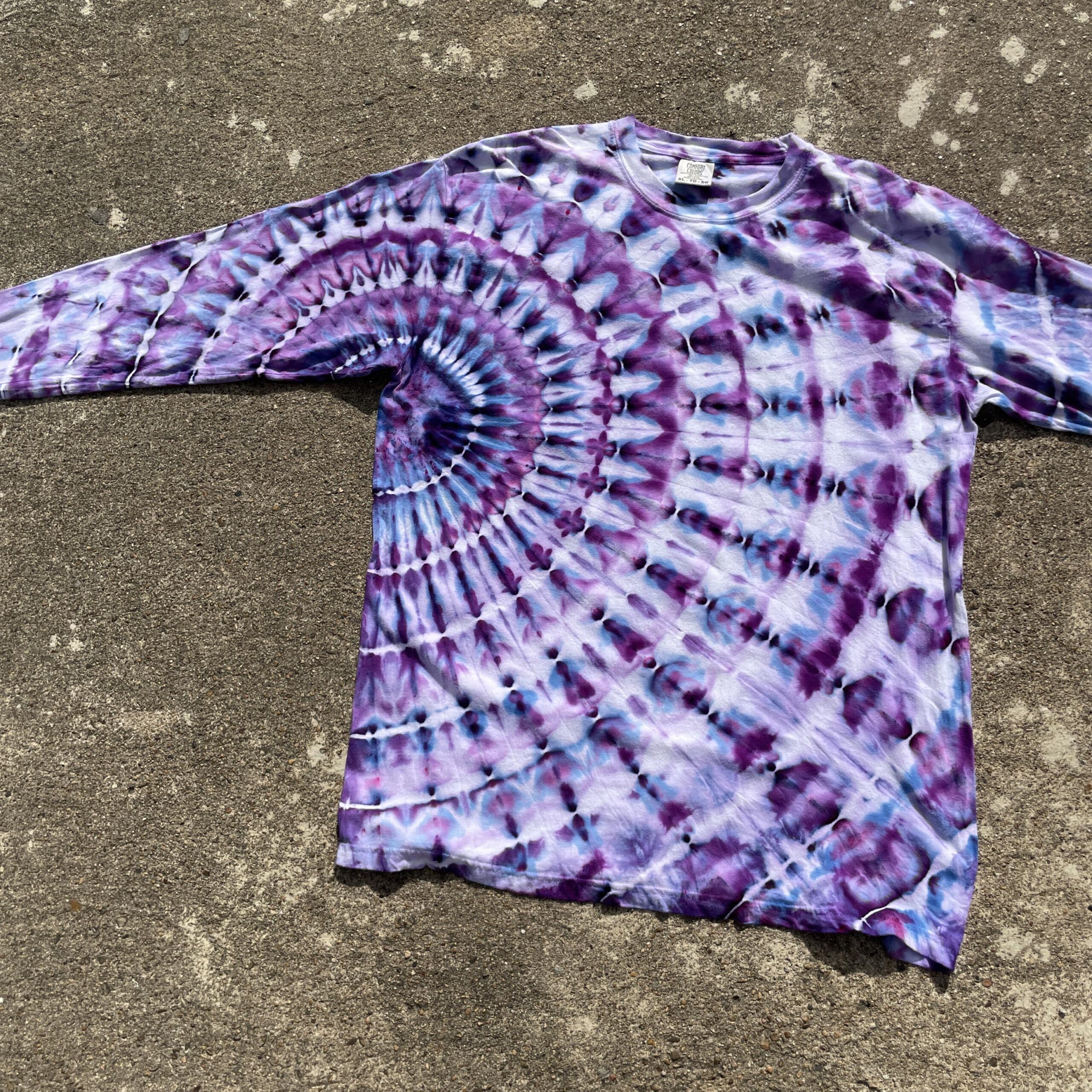
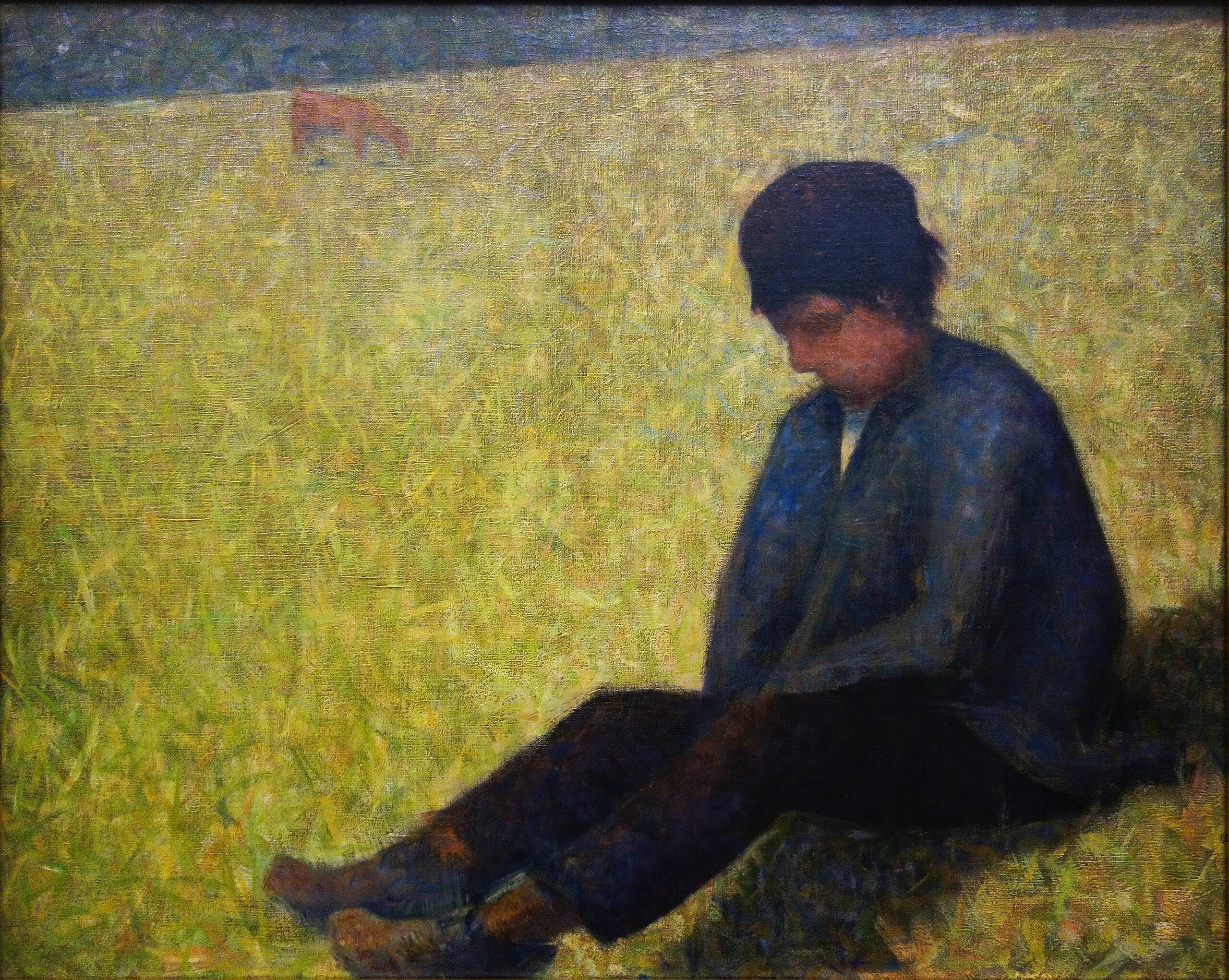
I created the advertisements in Photoshop. I hand drew masks using a Wacom drawing tablet. The tie-dye that selected was then placed, rotated and scaled. I also adjusted the curves and used smart filters to make the tie-dye blend in with the texture and feel of the paintings. I drew additional shading on some of the tie-dye to give it more depth and worked on blending the tie-dye into the paintings.
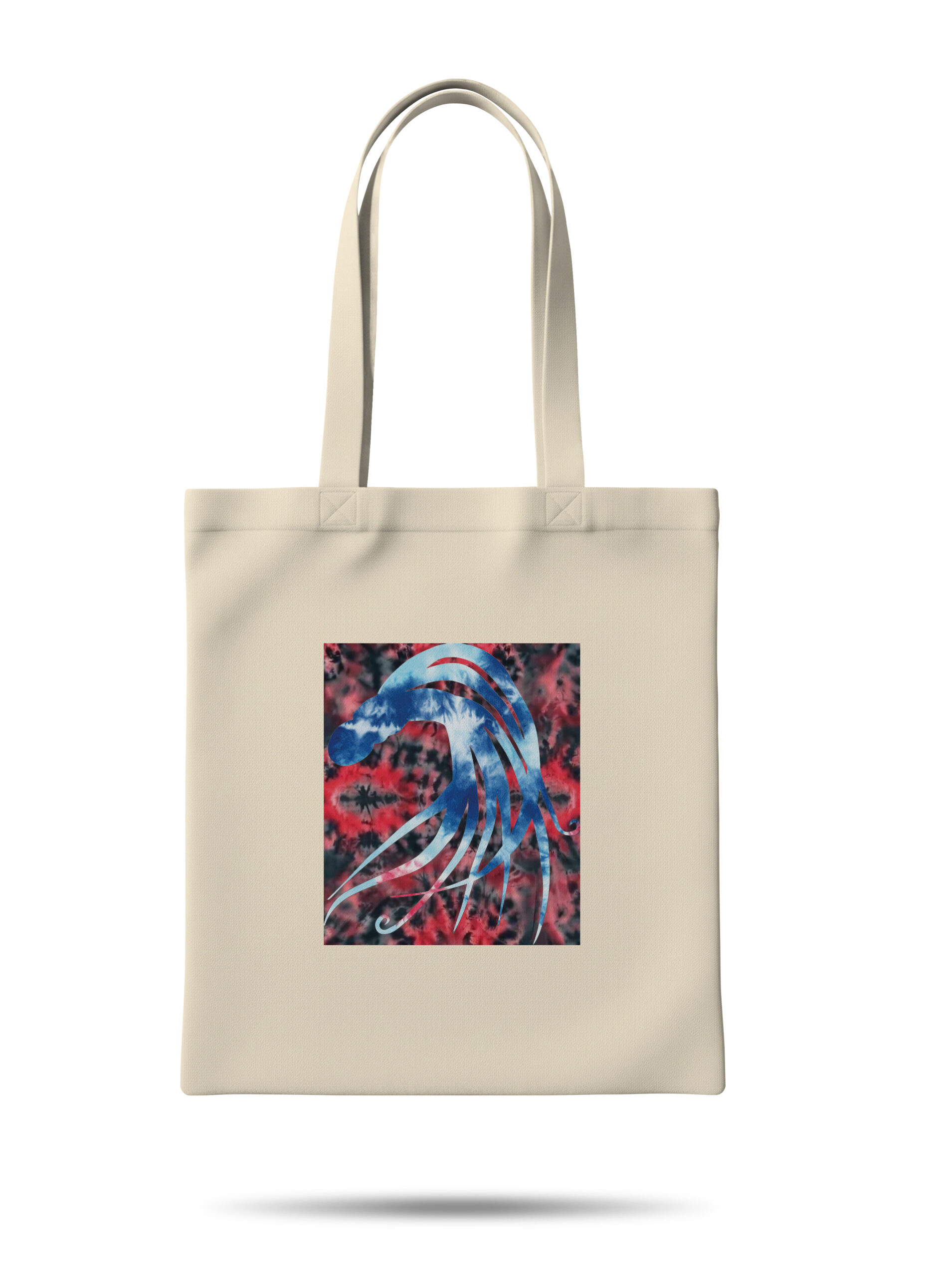
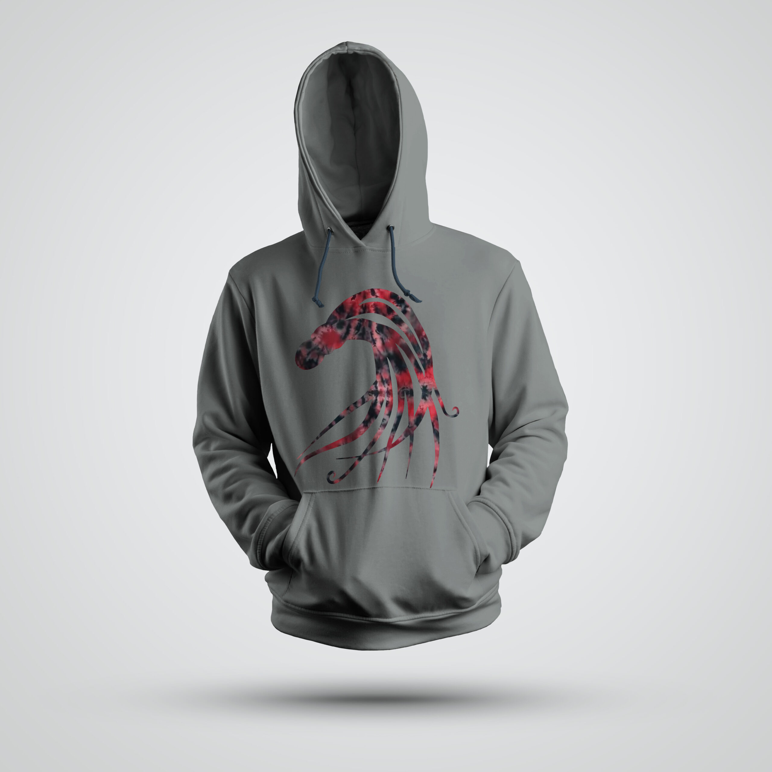
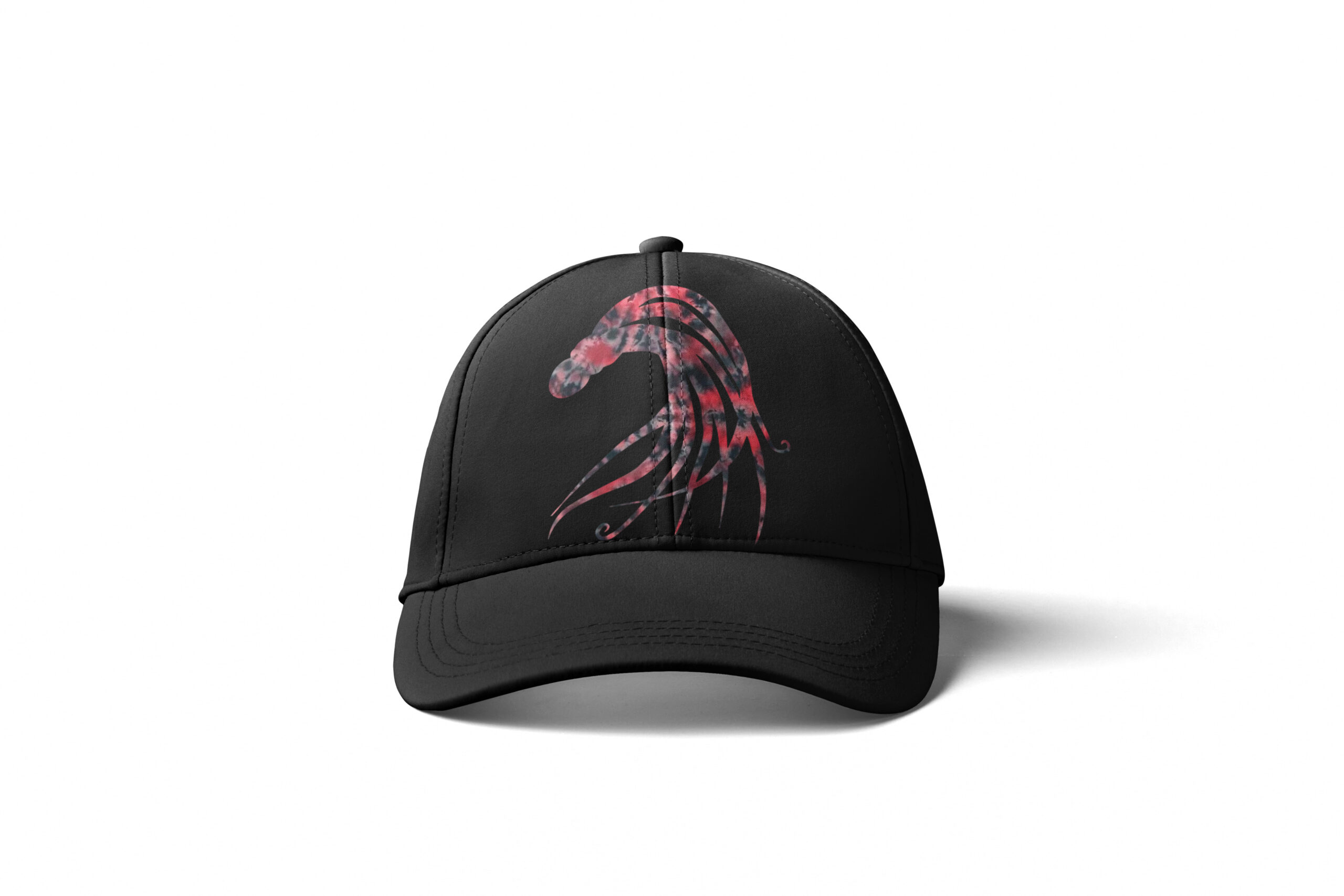
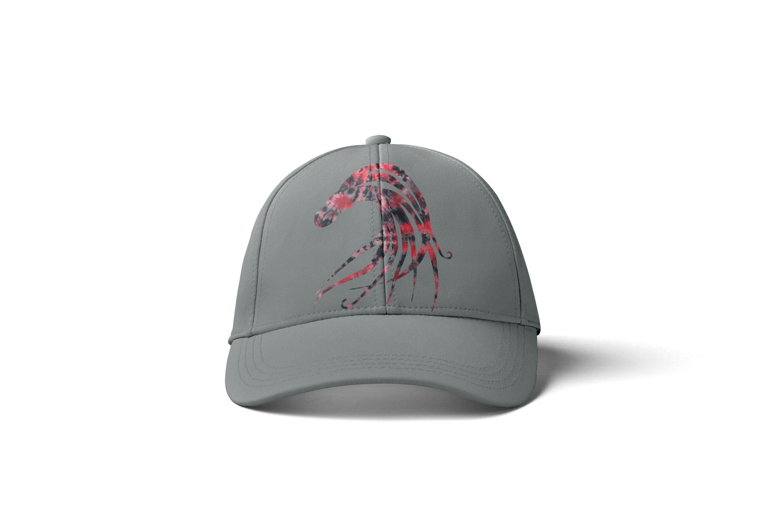
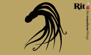
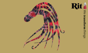
The logo is an octopus that I drew on paper and then traced in Illustrator. I chose the octopus as my logo because it transforms. An octopus changes its color and shape. The octopus can also create ink, and transform the environment around it. It is one of the few animals that comes with its own dye. The new Rit Octopus mascot logo is named Ritty the Octopus and should be used in Rit’s branding materials, and can also be used on its own as a symbol of transformation.
Design Solution
In this ad campaign my intention was to take something classic and spice it up with swatches of tie-dye color. I chose bright tie-dye that would contrast and pop with the beautiful and classic style of George Seurat. I designed a logo that fits in better conceptually with the brand. I made ads that emphasize transformation in the design and typography. I added the logo to the Rit dye packaging. I designed a video billboard ad and accompanying GIF. I also designed an ad system for year two that can be extended to future years or updates to the campaign.
The final product is a fun update for Rit, that could be further developed into a brand guide and fully refreshed marketing materials and identity. It demonstrates the potential that Rit products have in themselves, to be classy, or to be funky, or to be anything in between.
Logo Process & Elements
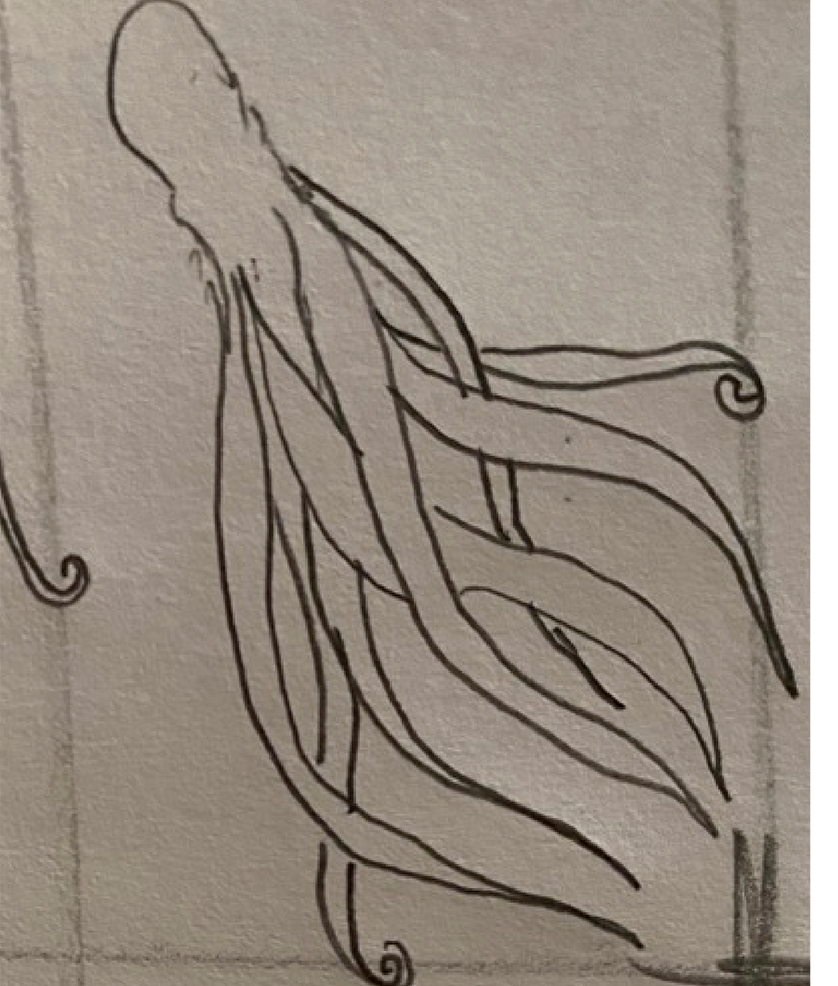
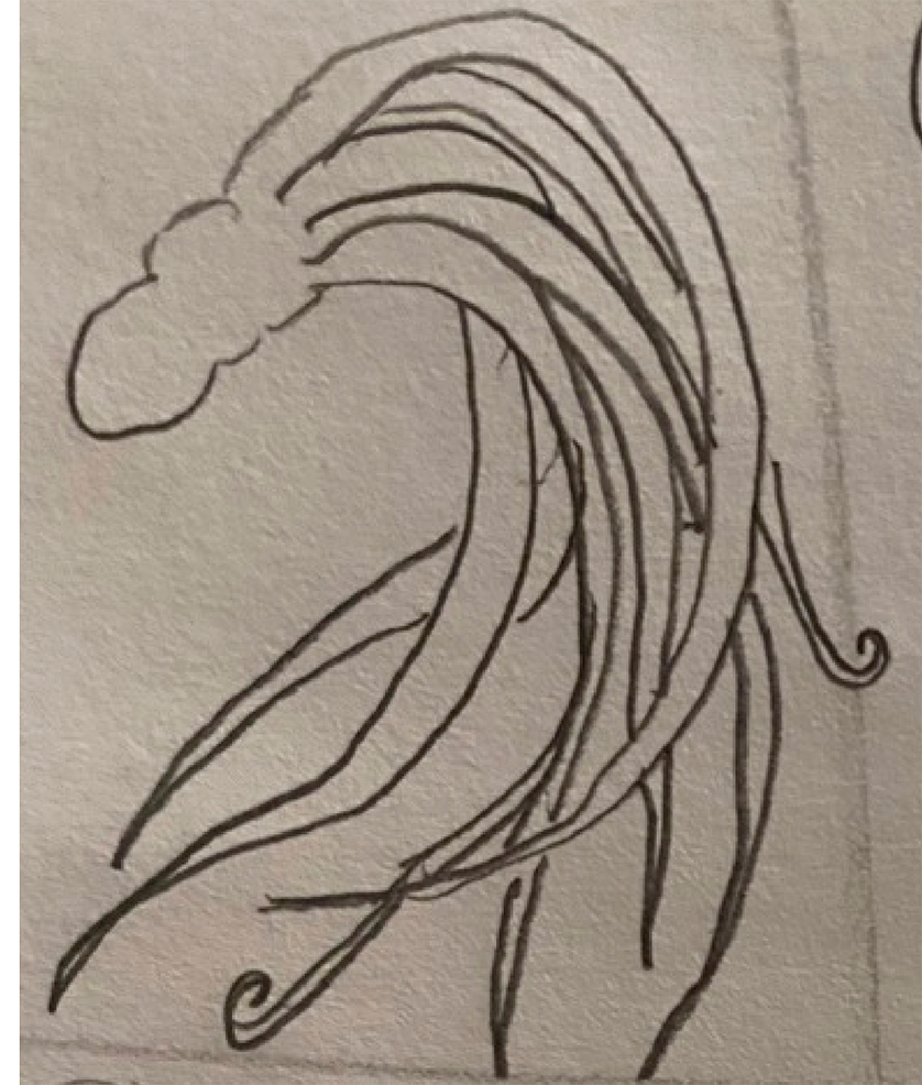

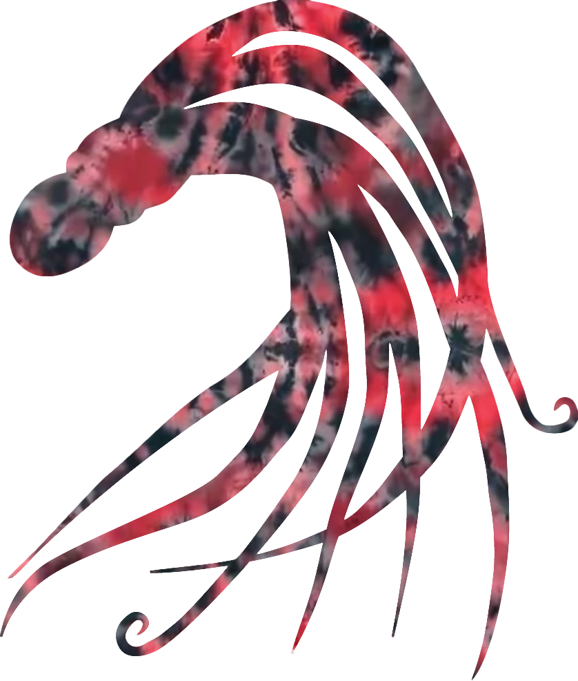
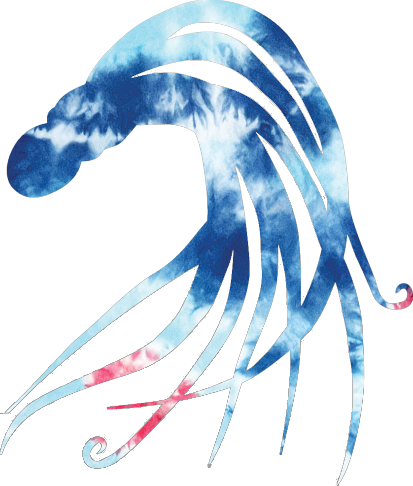
The new logo mascot is “Ritty the Octopus” and can be paired with the word mark or used on its own. Everyone loves an Octopus!
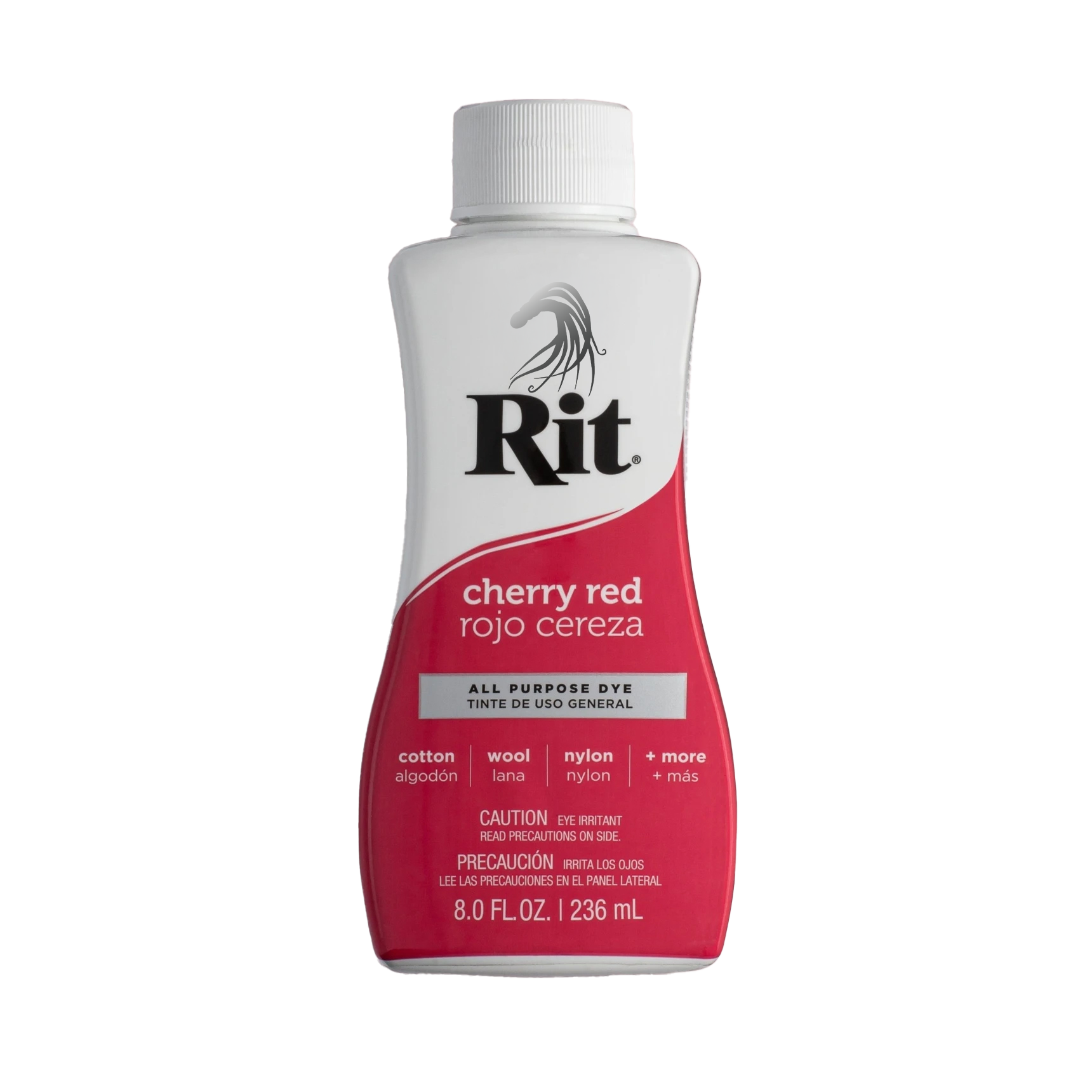
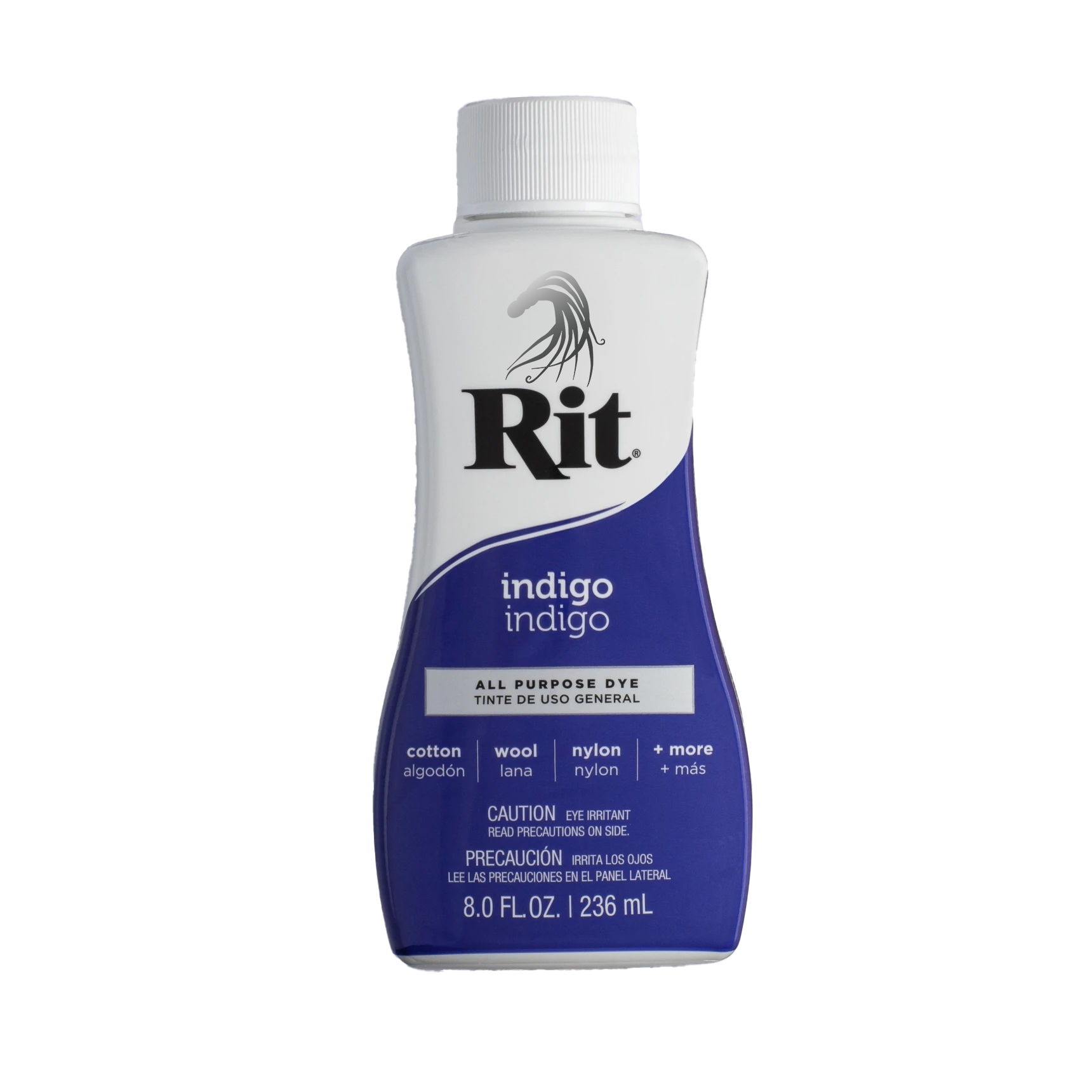
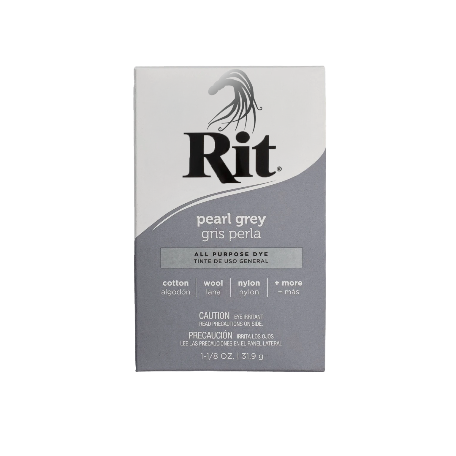
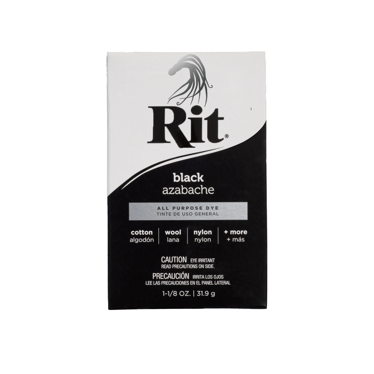
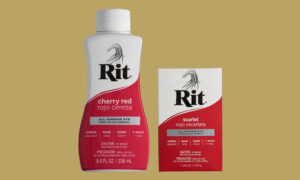
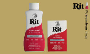
Packaging
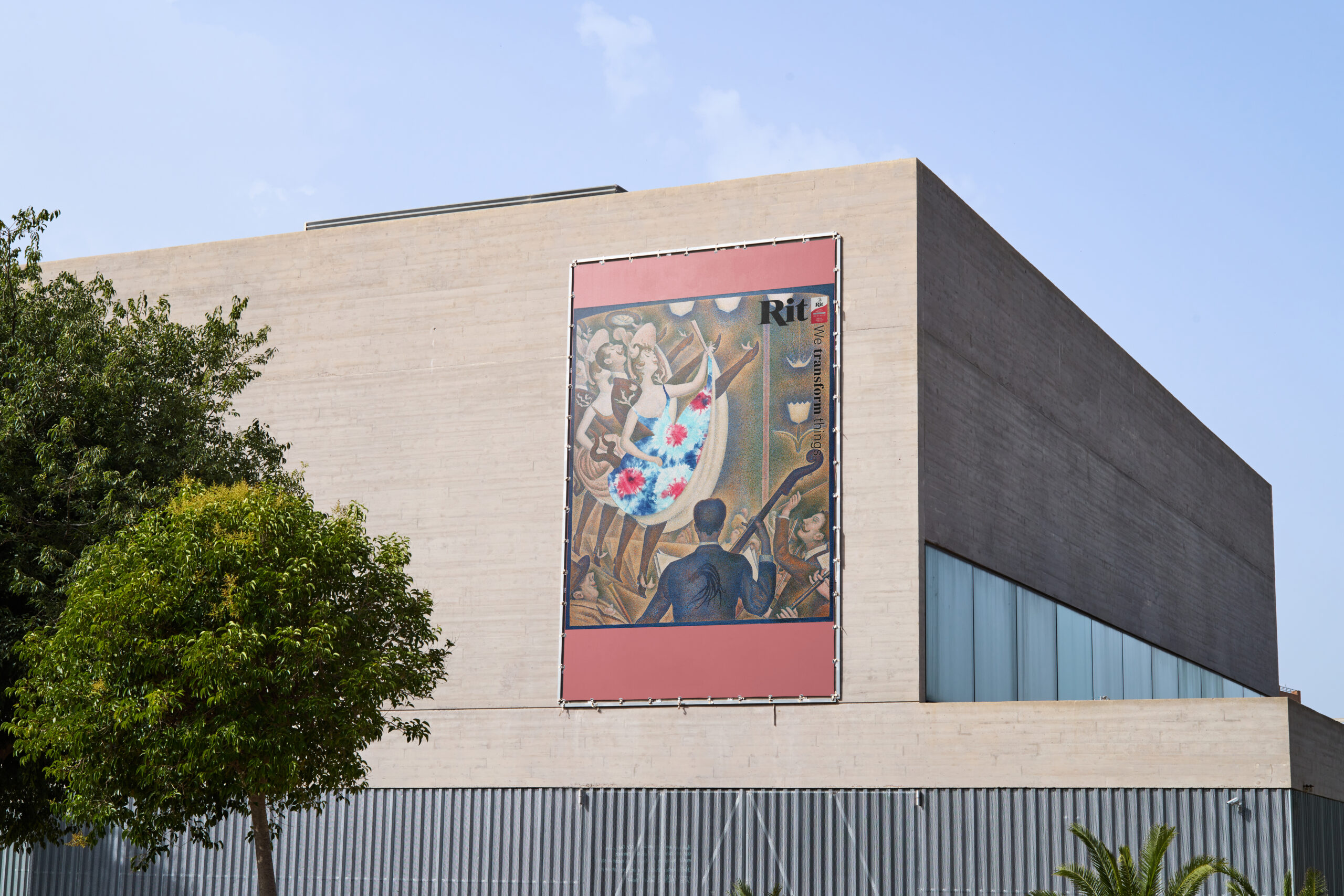
Year Two Advertising Campaign
The Transform advertising campaign system is designed to be used again in future years, and can adapt to artwork that is landscape or even paintings or artwork not by Georges Seurat. The guidelines for the campaign are to include all of the following: application of the tie-dye in a bold manner and inclusion of the word mark logo, the campaign slogan “We transform things,” Ritty the octopus mascot logo and of course Rit Dye in its powdered form in the box or the liquid form in the bottle.
Video Billboard
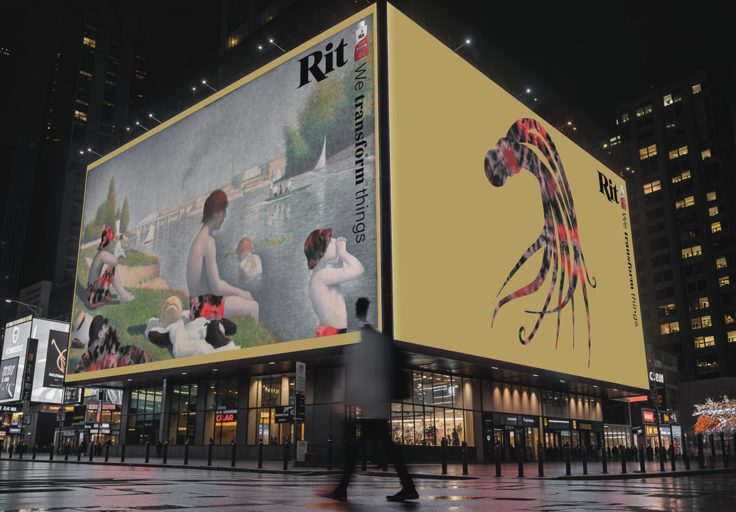
These are the frames for a a video that would appear on the video billboard.


Process Images


Ritty the Octopus Merchandise