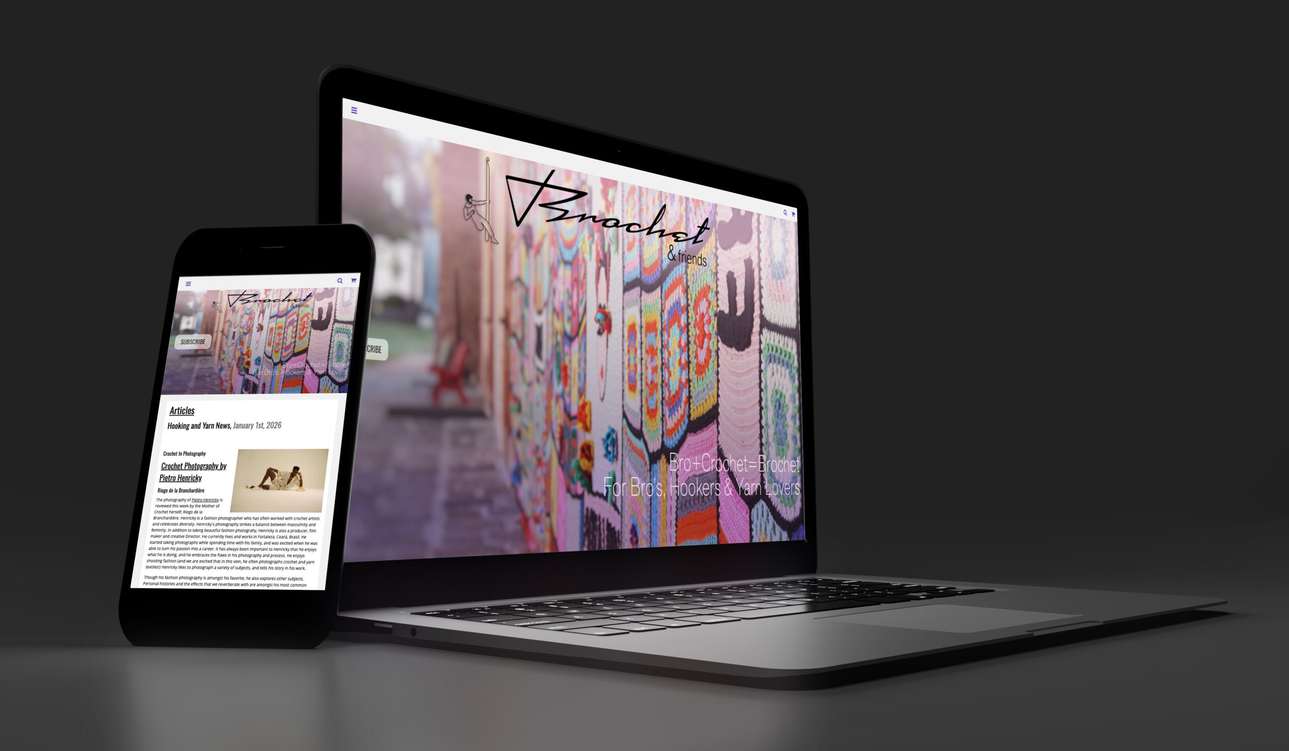
Brochet & Friends Website
This website is for anyone who uses a crochet hook (i.e. A Hooker.) We are yarn enthusiasts, Bros and people who love to challenge stereotypes and get crafty. We are for Crochet Lovers and Knitting enthusiasts. We also love colors and RAINBOWS and polka dots! This website is for all lovers of yarn and FUN!
Link to live website: https://seanarocka.github.io/x455-smcmahon-project/index.HTML
Background
Brochet & Friends is my love letter to retro 80’s and 90’s colors and style. It is inspired by early internet message boards (shutout to the lower lights and Bad Girls Club message boards!). It has articles, crochet patterns, and many pages to appeal to the Brochet audience. It is a project that I developed first as a magazine in InDesign class, and then as a website in HTML/CSS class. I love working on the idea, and in both classes the inspiration was about embellishments, learning how to add things like borders, drop shadows, glitter and razzle dazzle. For my portfolio I have refined the website, removed some of the extra elements when they were in the way, and tried to maintain all of zest.
Target Audience
This website is for anyone who uses a crochet hook (i.e. A Hooker.) The Brochet Community is yarn enthusiasts, Bros and people who love to challenge stereotypes and get crafty. We are for crochet lovers and knitting enthusiasts. We also love colors and RAINBOWS and polka dots! This website is for all lovers of yarn and fun. The point of view is slightly fashion, but also slightly crafty and always funky.
Design Problem
Code 6 web pages in HTML and CSS and make use of JavaScript and jQuery to enhance the web pages functionality with following components: full screen image, video paragraphs of text, images embedded into text blocks, hyperlinks to external websites, slide carousels and scrollable text areas, sortable table with headers and columns.
Aesthetically I wanted to try to work with all of the coding features, and my favorite over the top elements (polka dots, loud colors, drop shadows) and celebrate them.
Design Process
Wire frame website with pencil and paper. Designs where based on goals including using a “Z” design that guides the eye visually in a “Z” pattern for the home page. I also wanted to create asymmetrical designs for the website. I created the website using Visual Studio Code and a W3 Schools CSS template that I customized to implement the ideas that I had done in my mockups. I also tried to emulate the style of a printed magazines on the home page and articles page. I chose the template that I did because it was using rows and columns to create this effect, which was challenging until I got the hang of it, and has helped my understanding of containers and wrappers in websites in general. I also wanted to build out the website as much as I could, to a fully scrollable homepage, but also individual pages. I love this idea and wanted to conceptualize it as much as time has allowed for.
I used HTML, CSS and JavaScript with jQuery for this website. I used a W3Schools template that I customized and then added extra pages to.
Design Solution
I met my goals and made some new goals for the pages as I went along, and as I was able to understand things and get the HTML, CSS and JavaScript all working correctly. I was able to figure out gradients (and animations) and include them in multiple examples. I have also spent time on the refinement of this project removing many of the drop shadows (surprisingly!! I know there are still a couple), and working on the colors and the masthead to try to both include maximal features, but also streamline it so that it fits into my portfolio and my aesthetic.
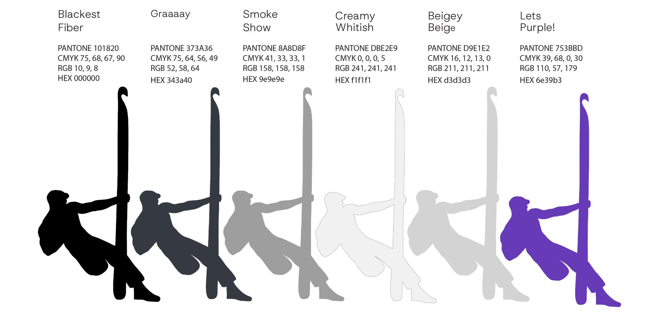
Color Palette
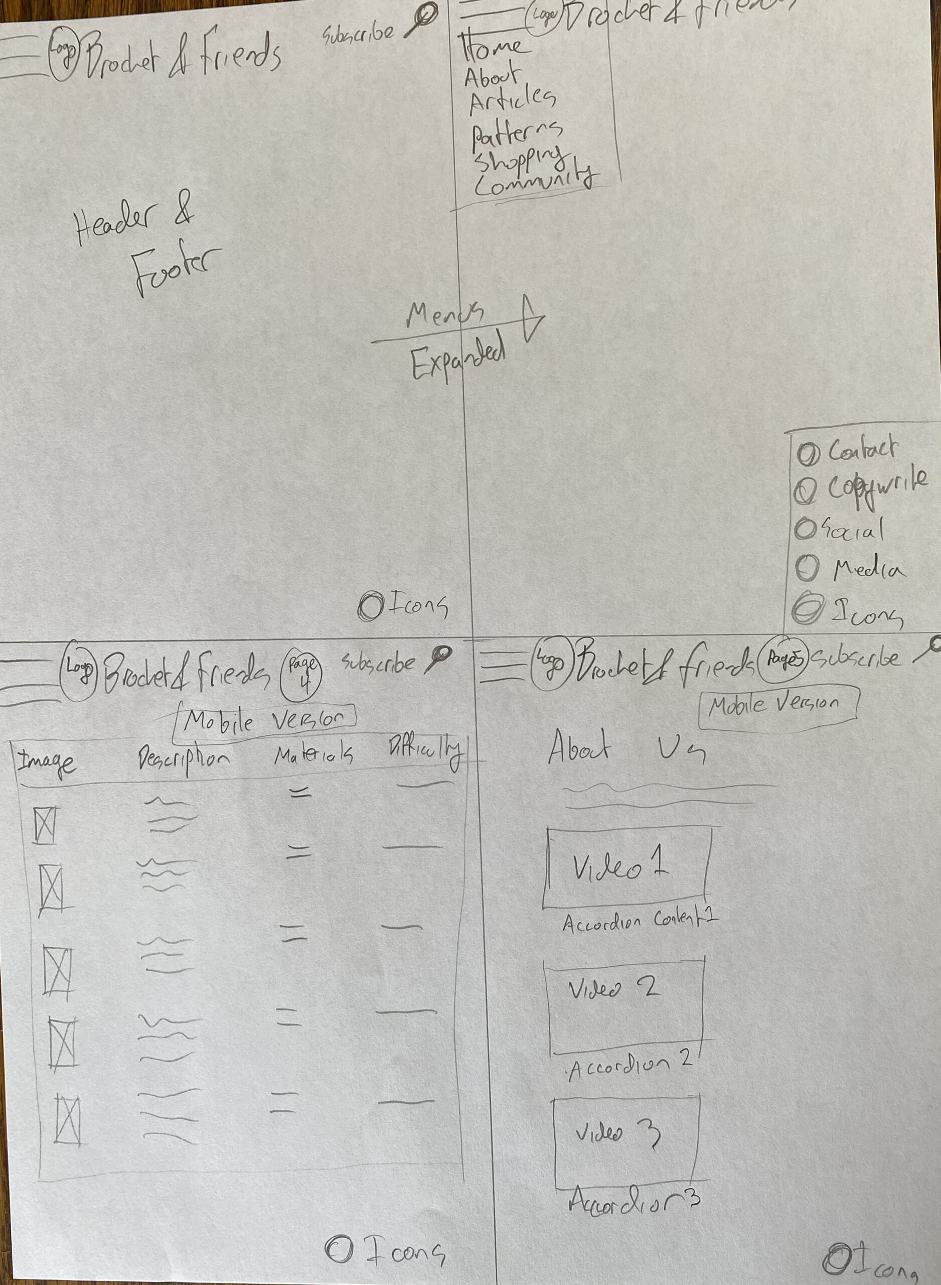
Wireframe Sketches
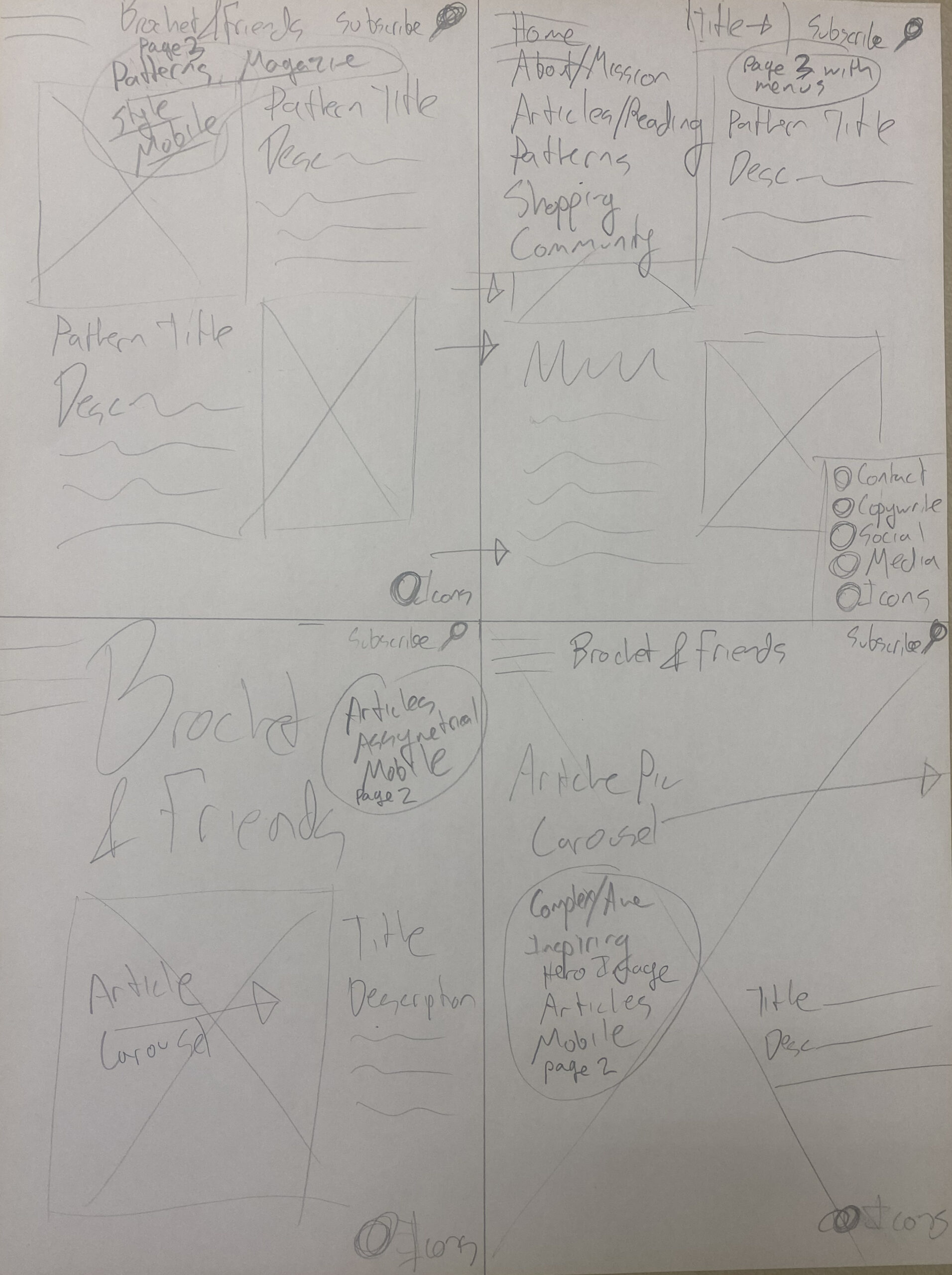
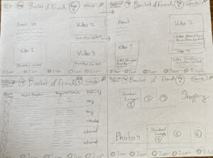
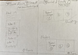
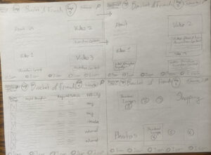
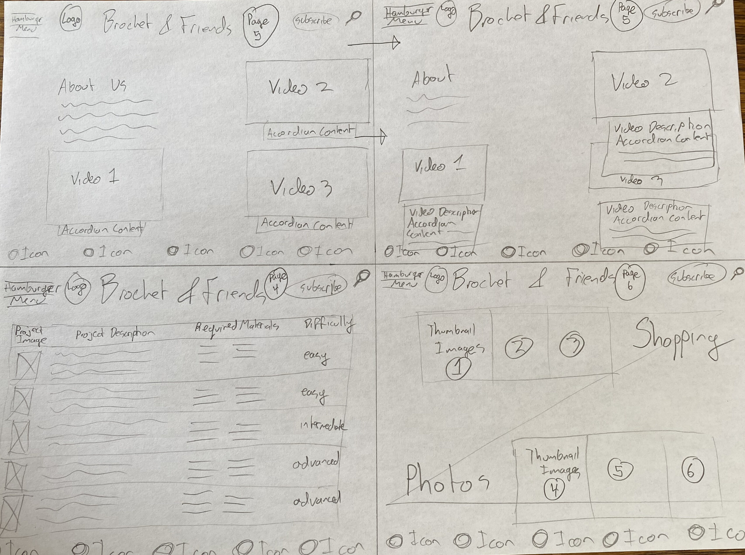
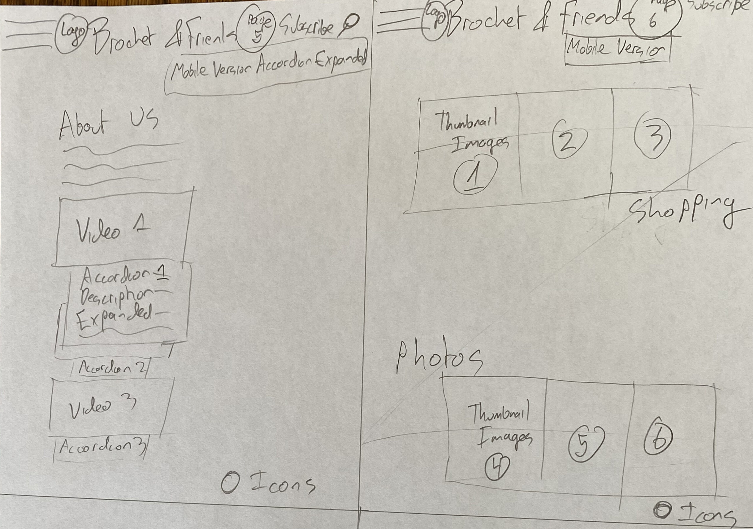
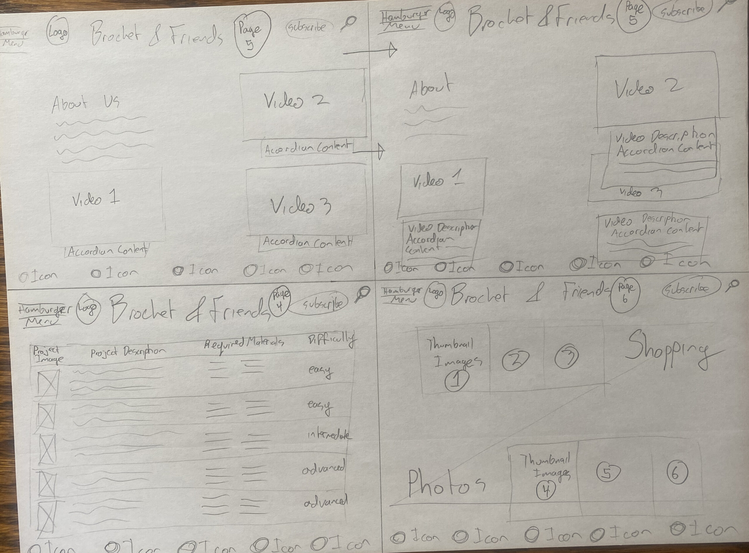
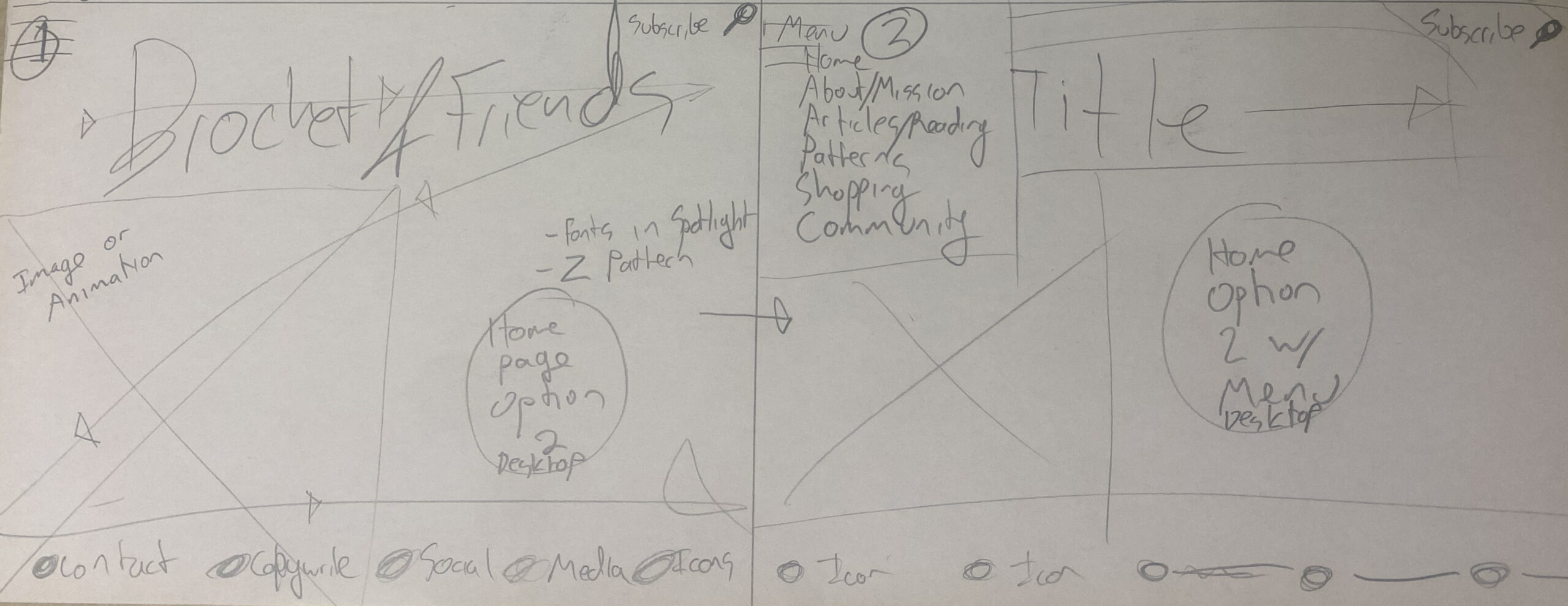
Initial Website Mockups
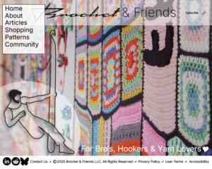
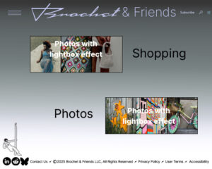
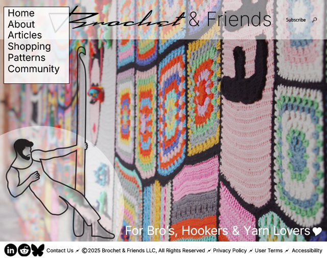
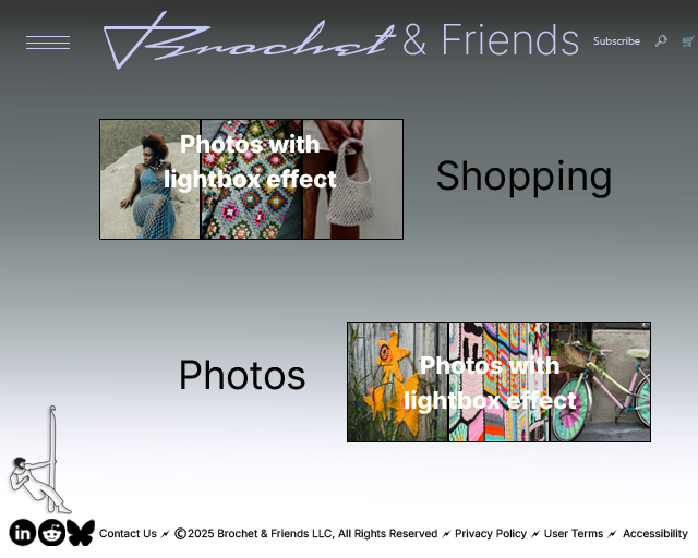
Brochet Guy Logo
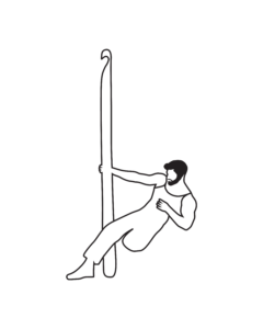
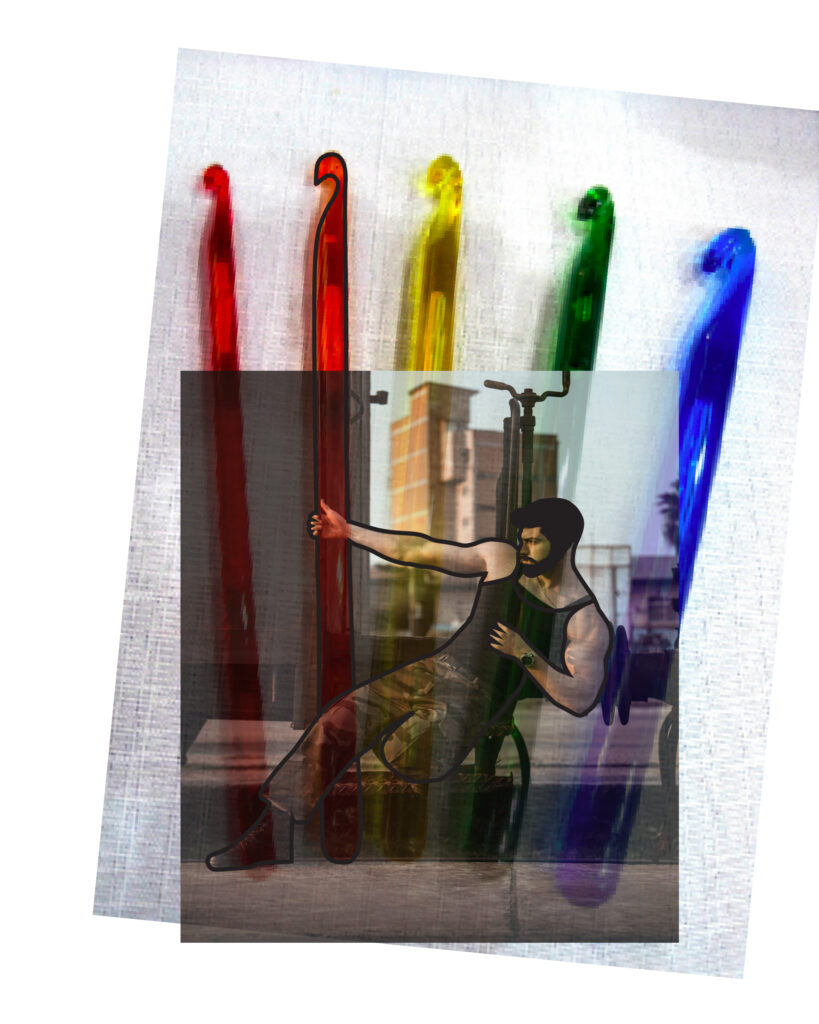
I used the images of crochet hooks and a muscular gentleman, and then traced the shape in Illustrator.
Magazine Concept
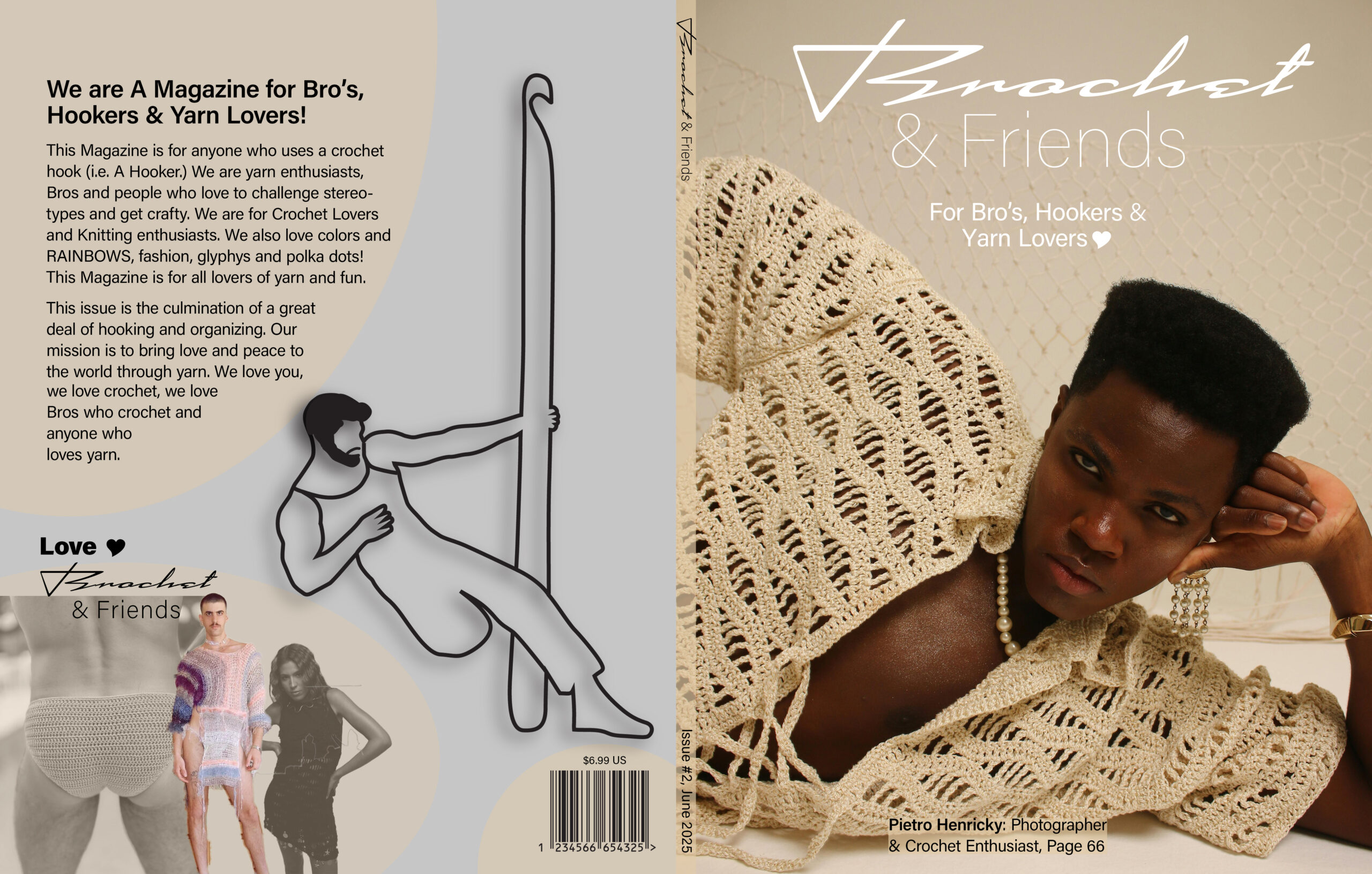
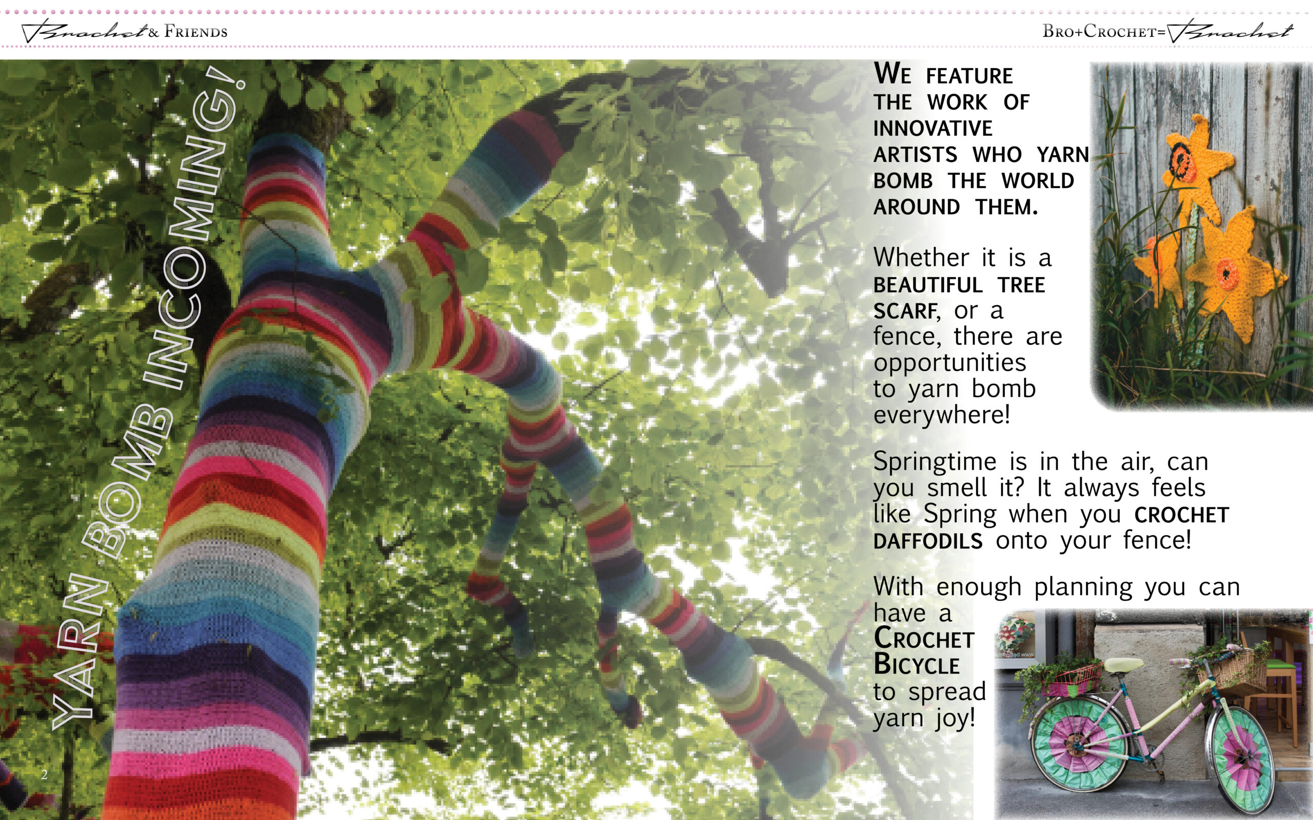
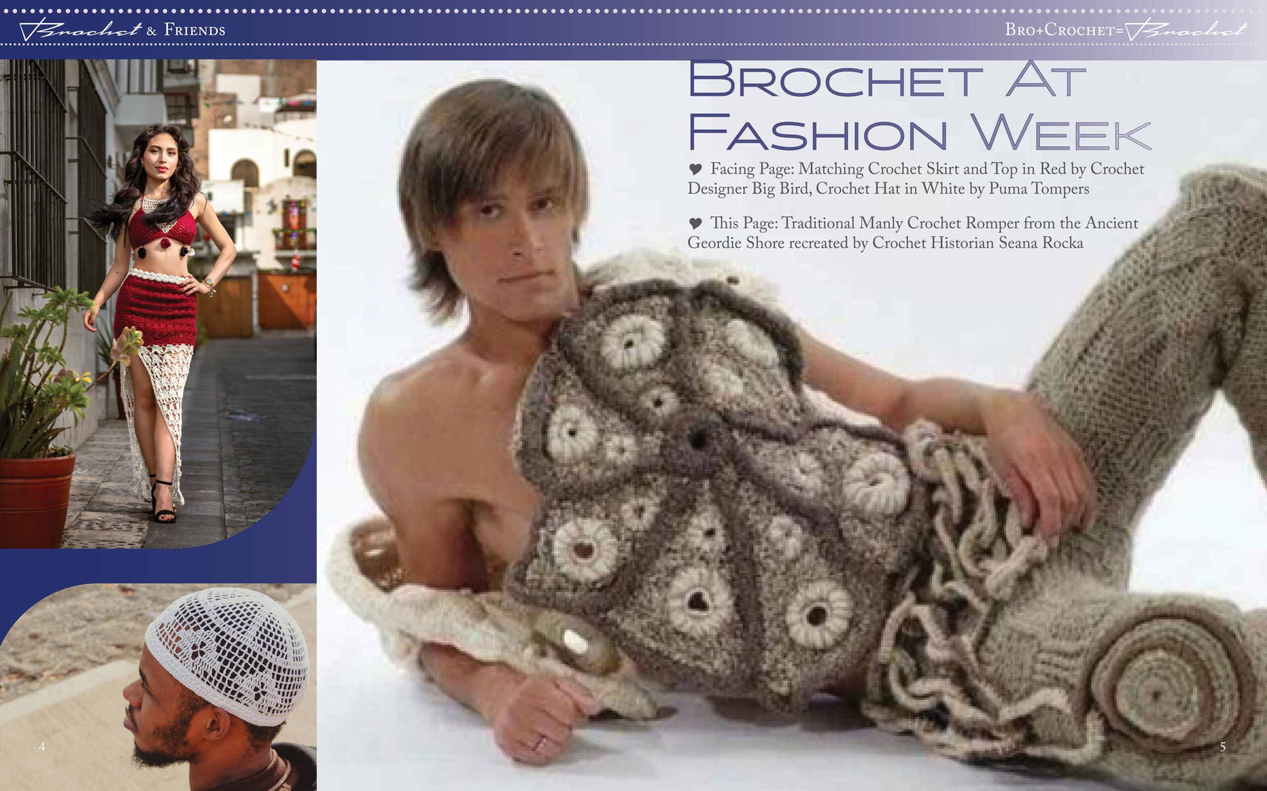
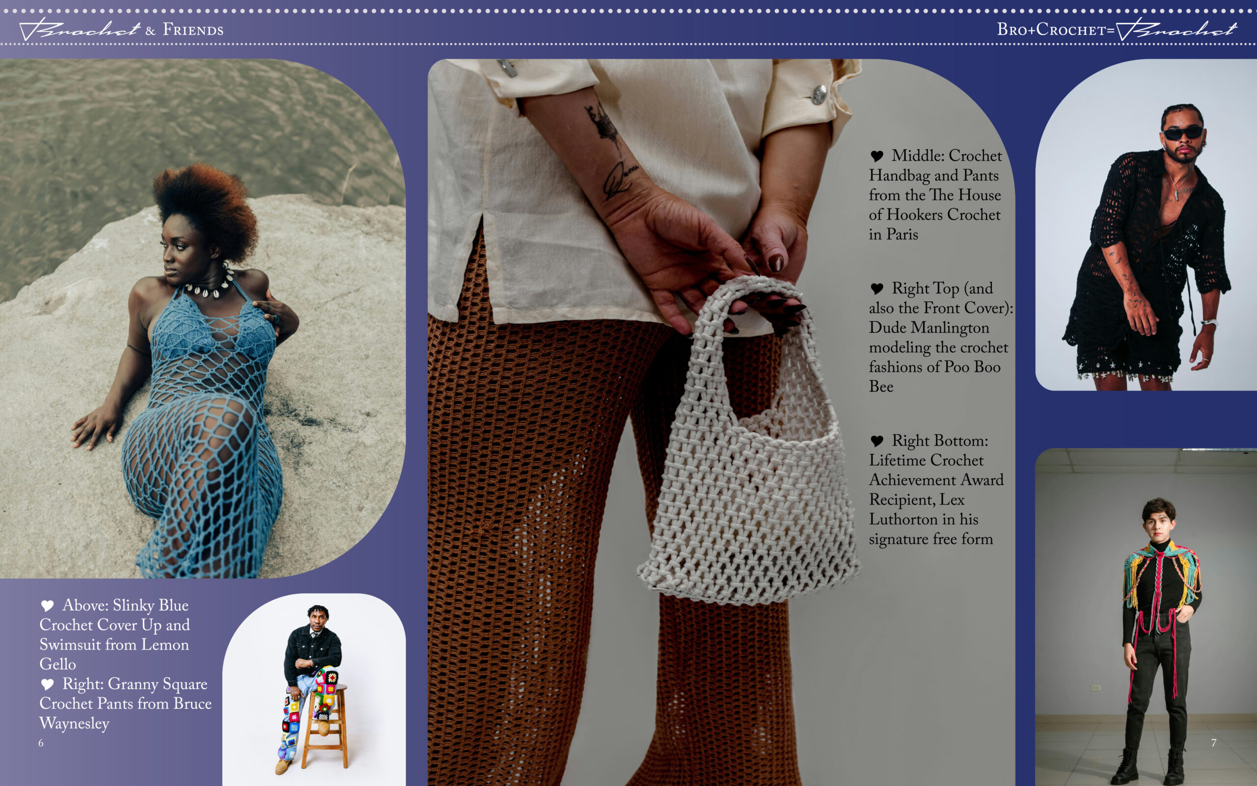
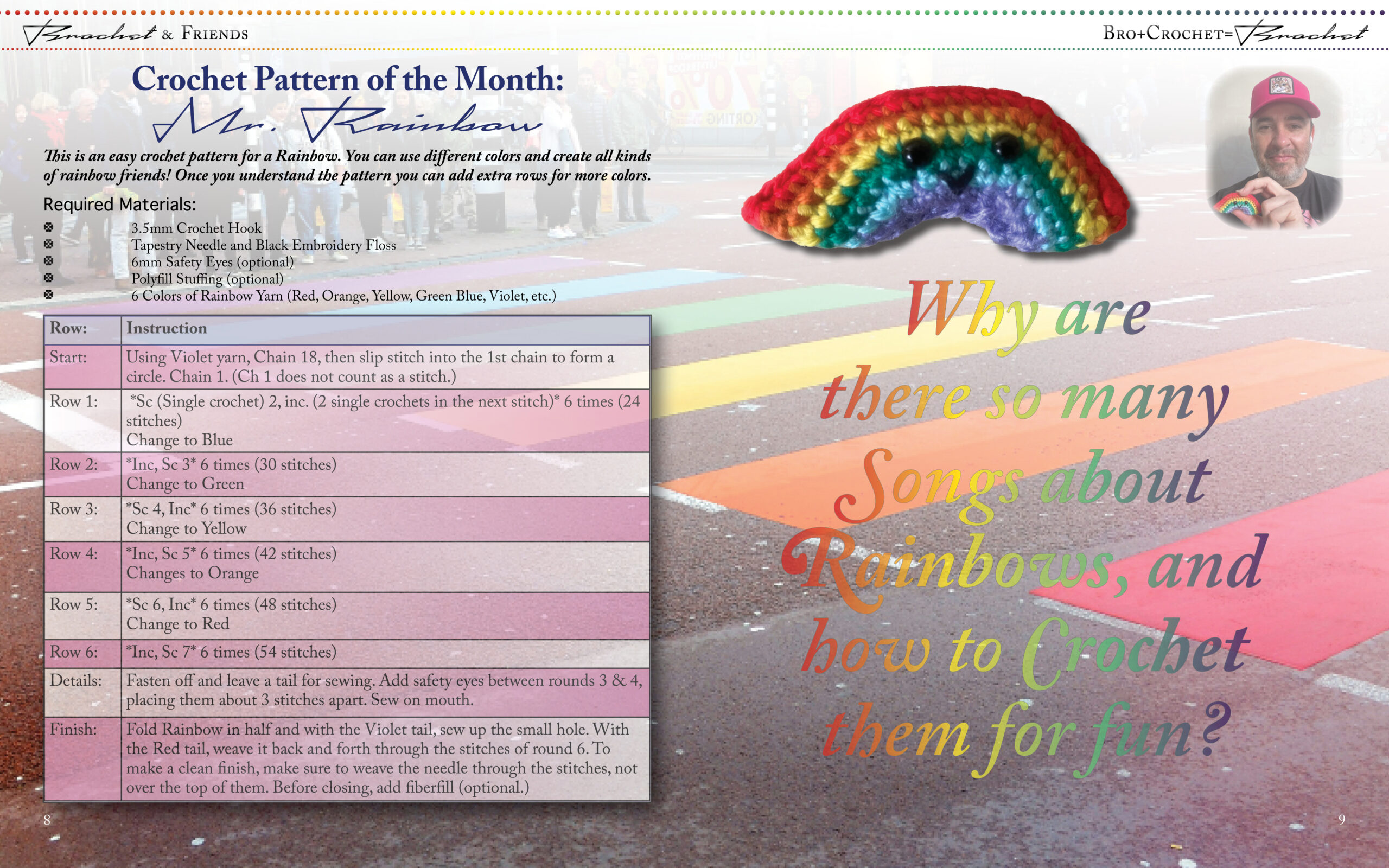
I developed this idea first as a magazine, and these are some of the covers and spreads from earlier in this process. Given more time I would update these designs and bring them into the style guide that is being used for this website (typography, colors, etc.)
Website Grid
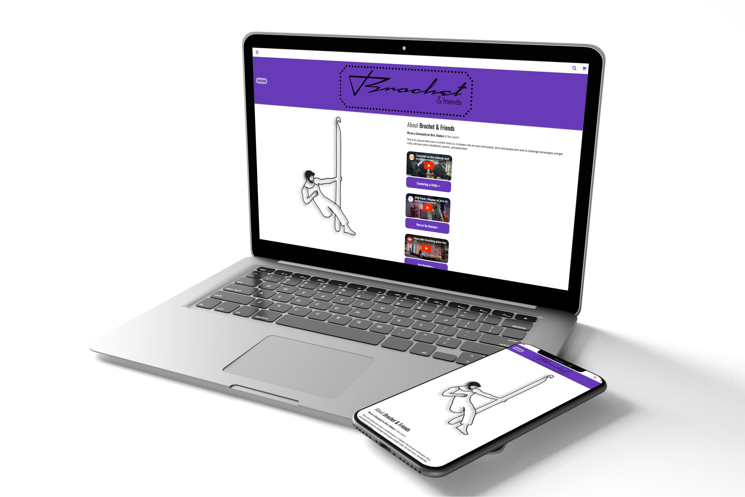
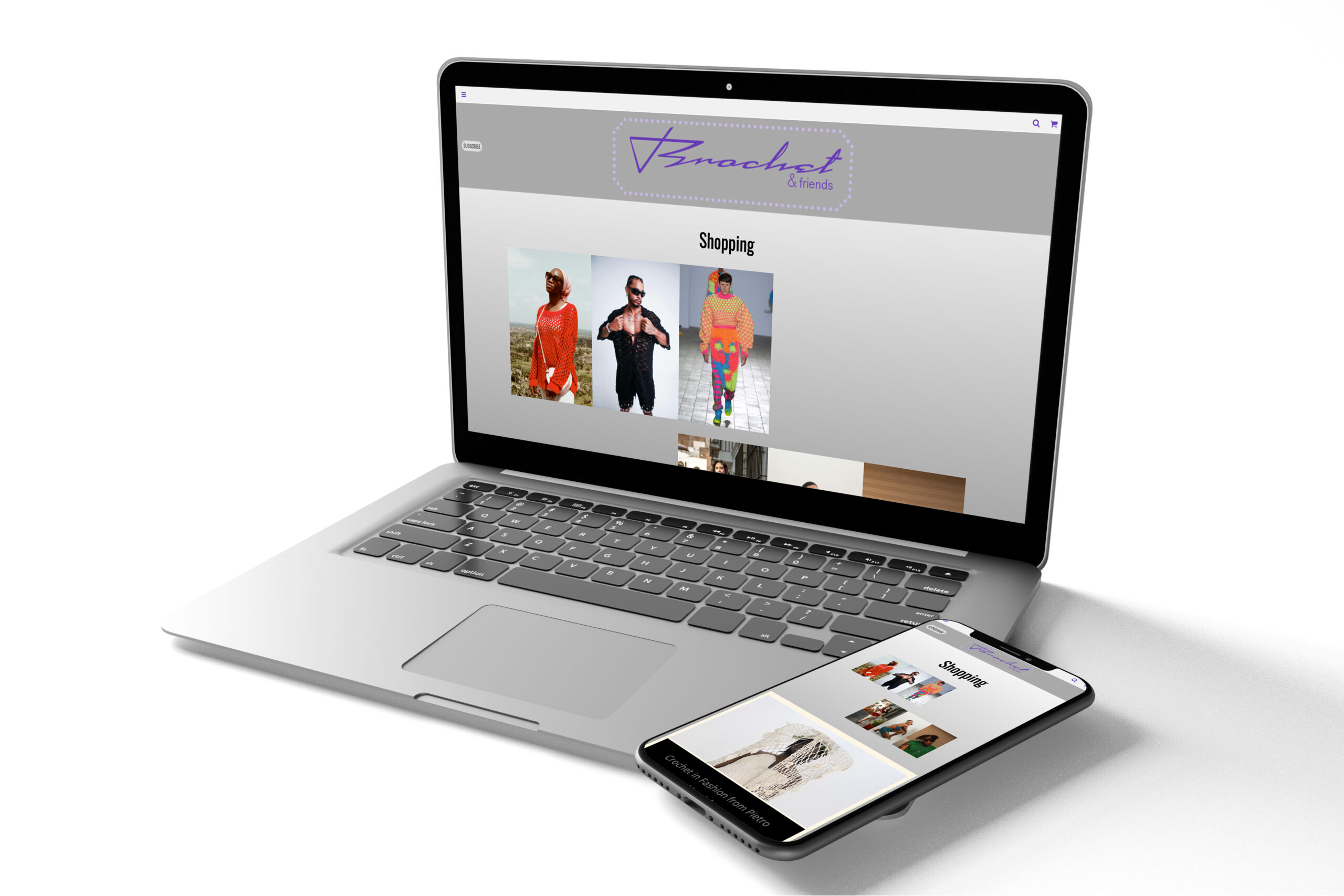
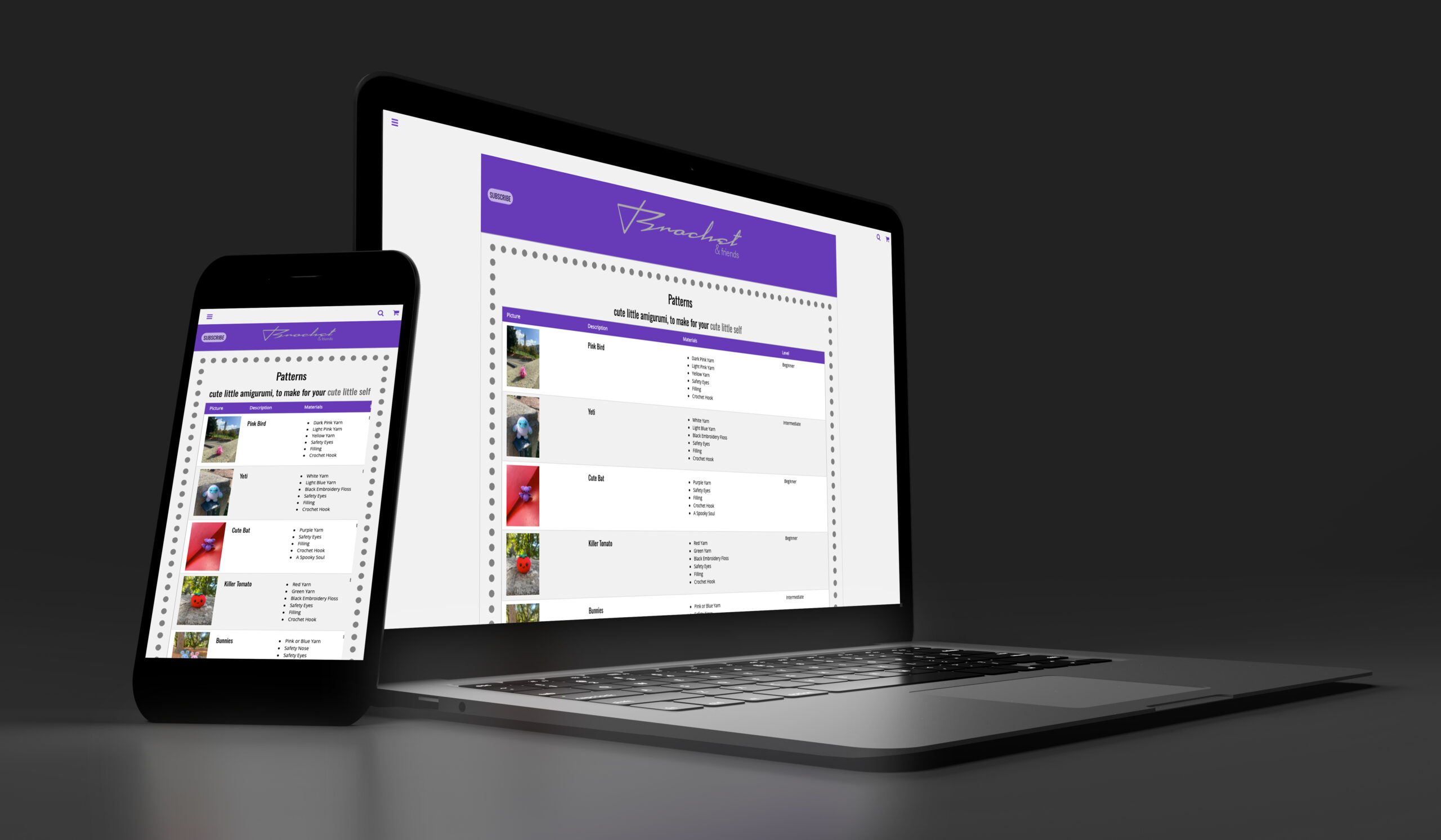
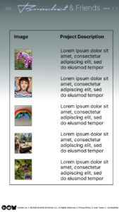
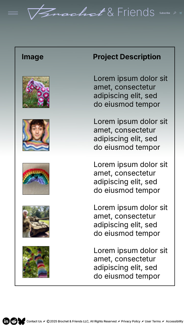
Though the design for this website is very responsive, and the grids and columns are coded into the pages and function properly, I did also spend additional time getting things like the table on the index page and patterns so that it would work on my phone. On the about page the table scales down and on the patterns page it becomes scrollable. This was all coding/refining work.

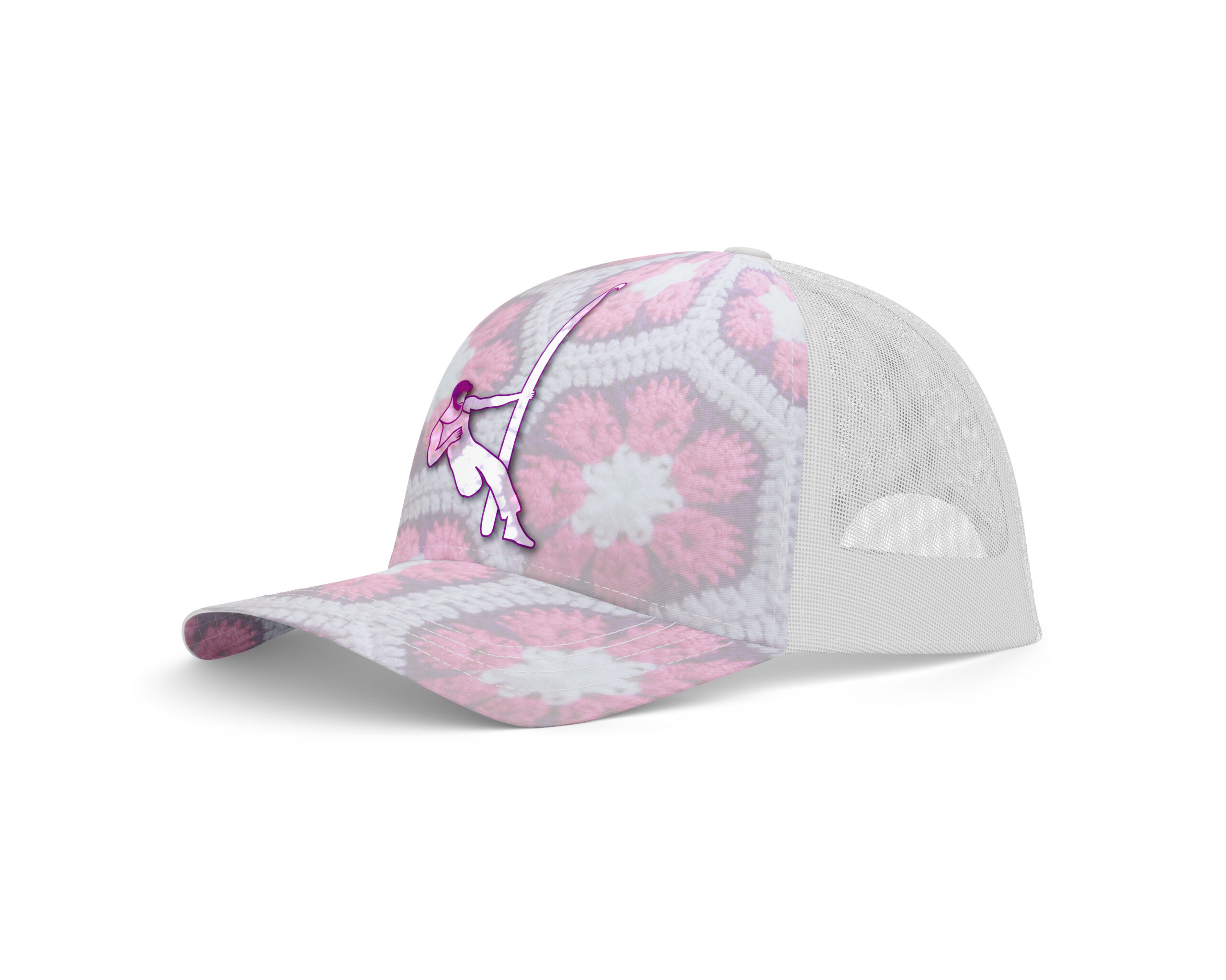
Brochet Hat